

Concept
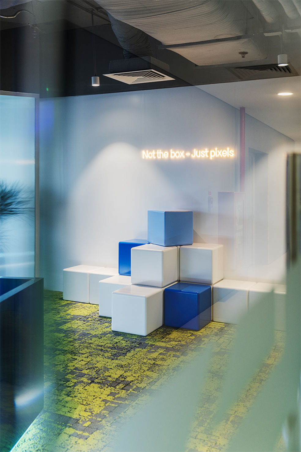
“The Voice of Pixels” concept is a design developed from pixels in the form of 3D cubes. We want to create a workspace that is unique, different, and inspiring. The pixel image is mined and repeated throughout the space in a uniform manner. The balance of proportions and the use of different combinations of colors and materials make the repetition not boring but bring a lot of emotion when experienced in this space.
“Not the box, just pixels”: pixels are not blocks, and space is not just a “box”. What we see can be seen differently; “think out of the box” pointing to new angles, expanding and limiting to create breakthroughs – just pixels.
Layout
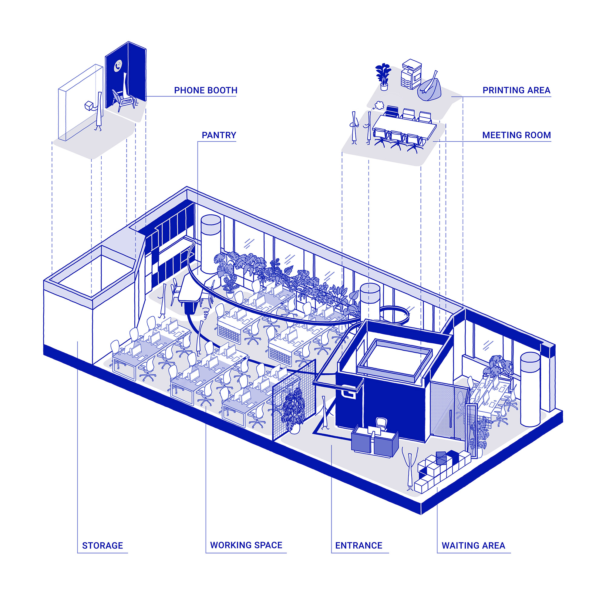
The space is organized to ensure smooth traffic and reflect the project’s spirit.
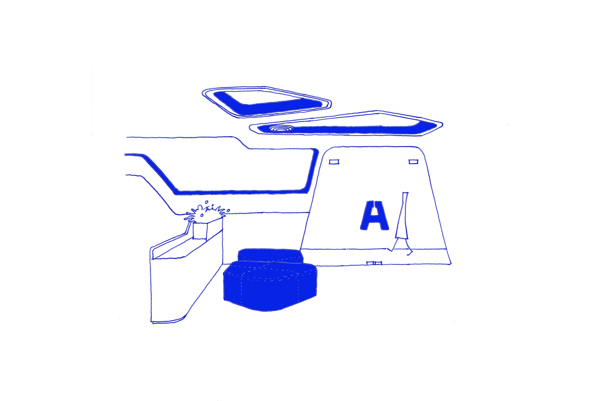
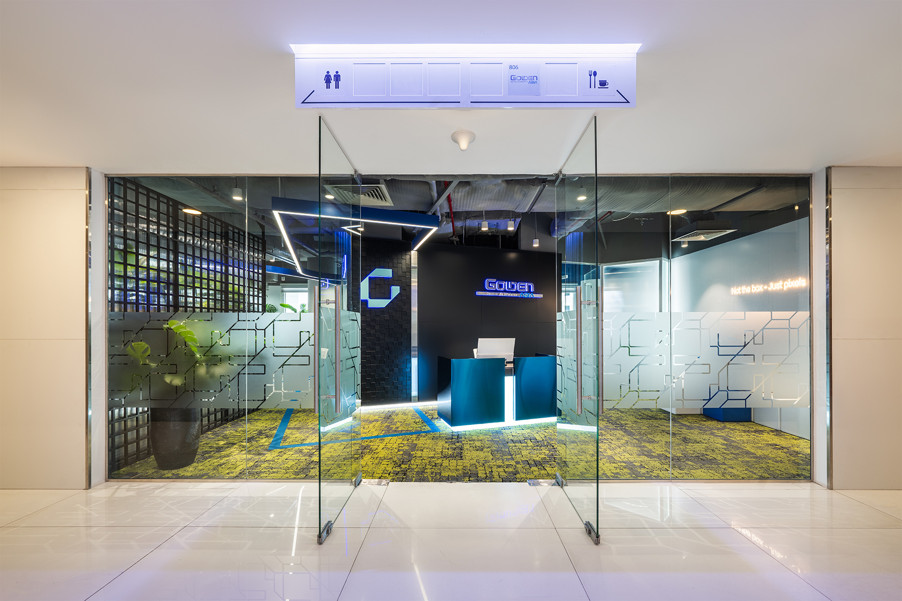
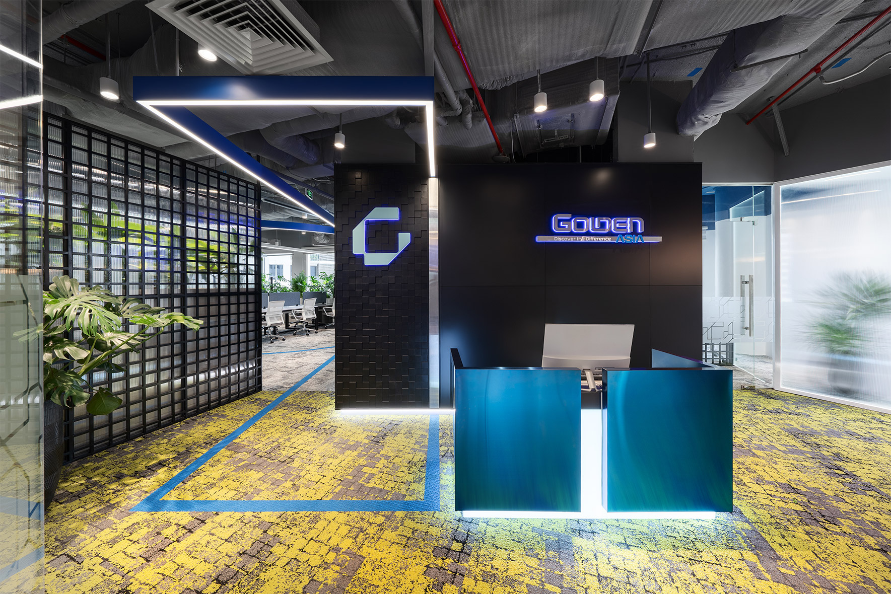
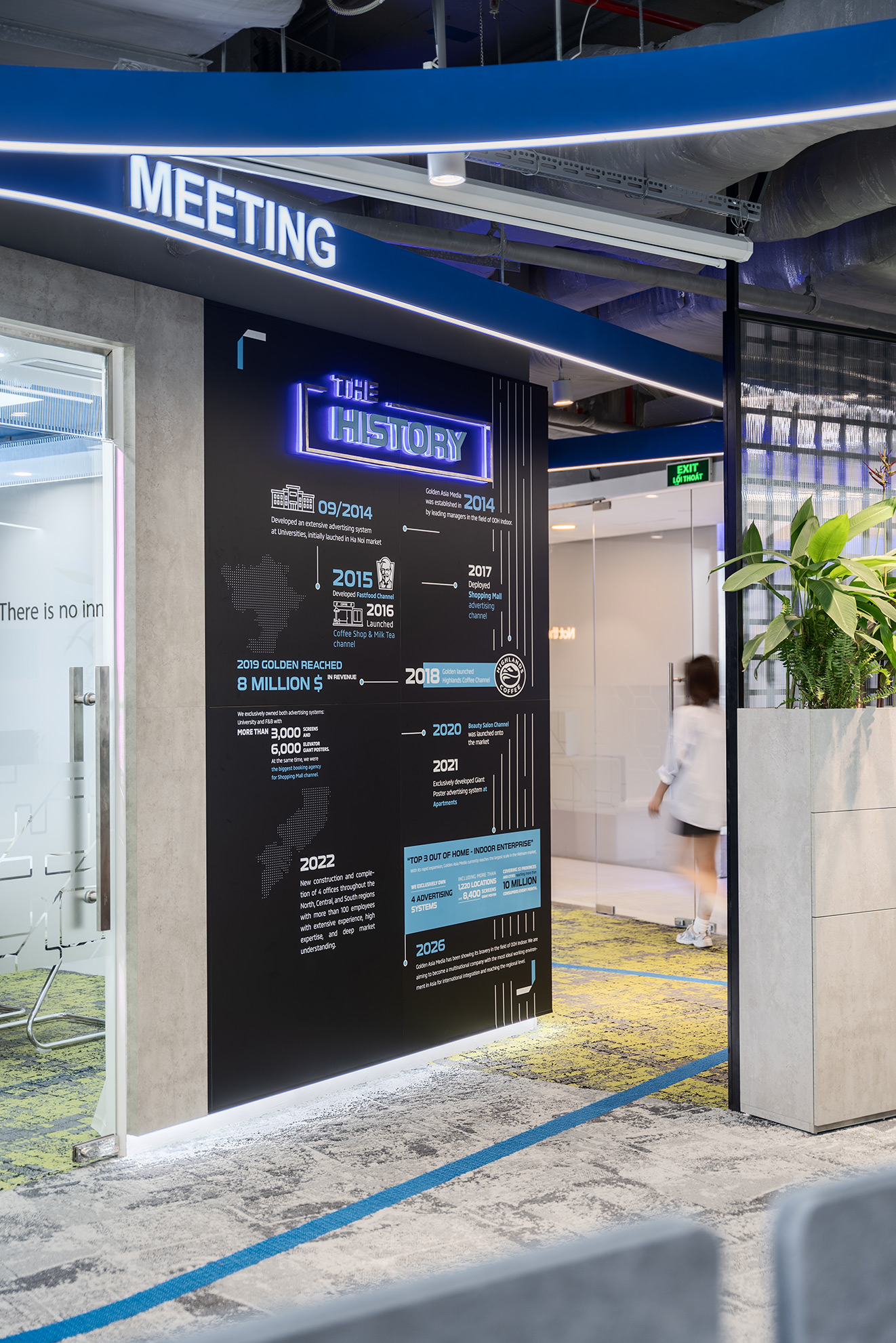
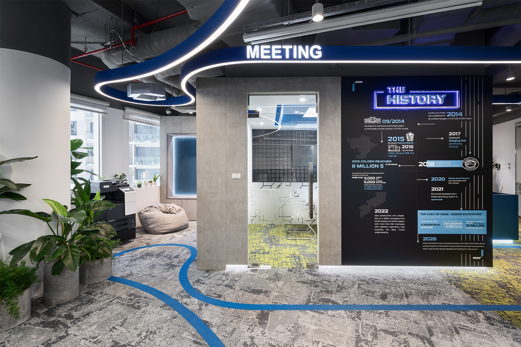
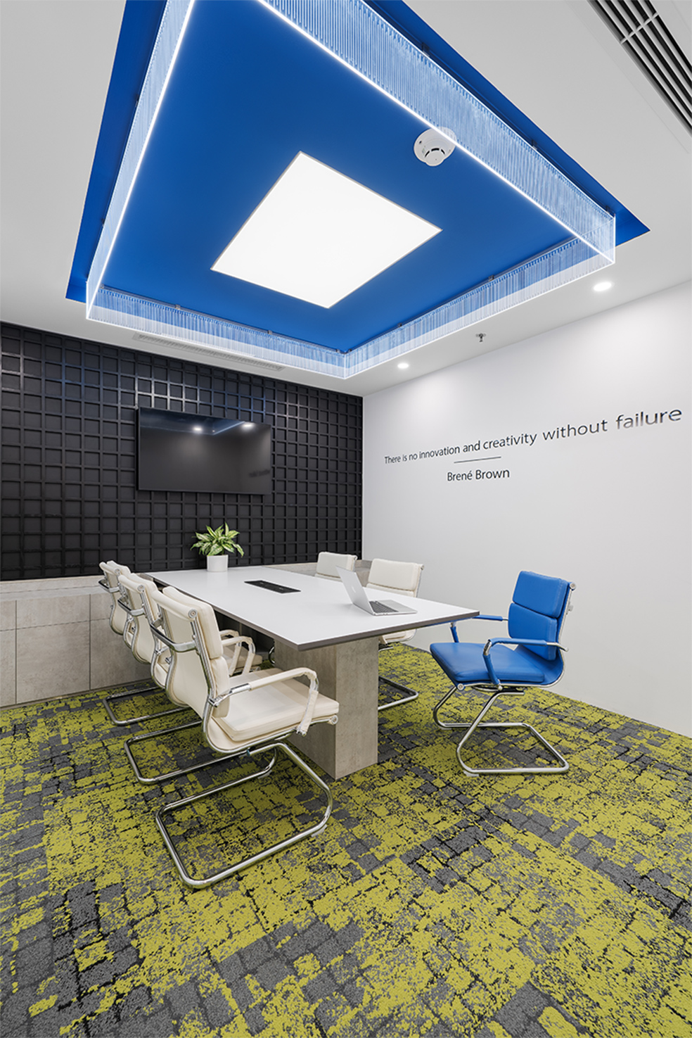
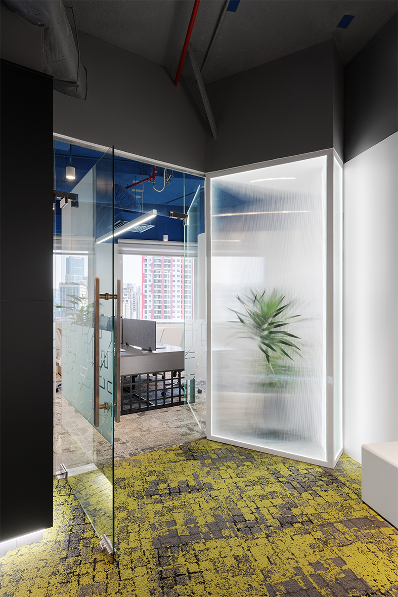
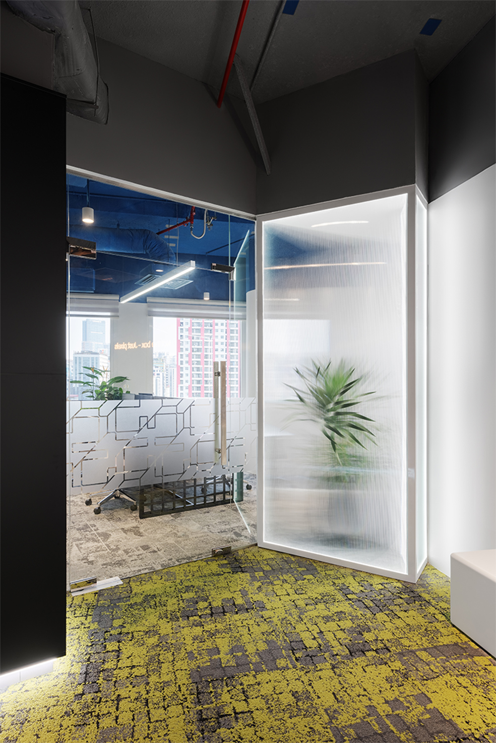
- The reception area takes the meeting room wall as a backdrop, and the meeting room is arranged like a giant box, making it the first point of impression when entering the office.
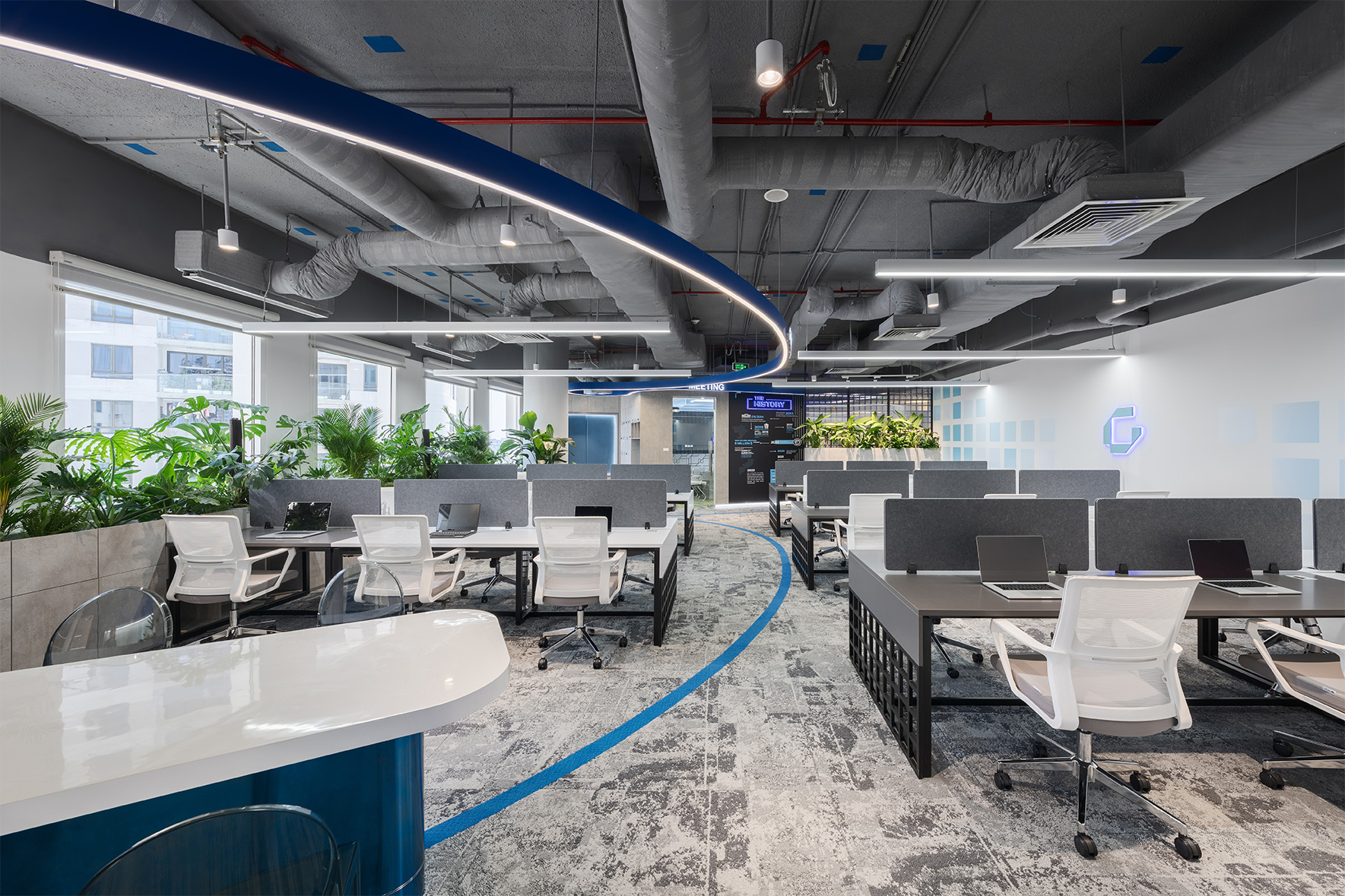
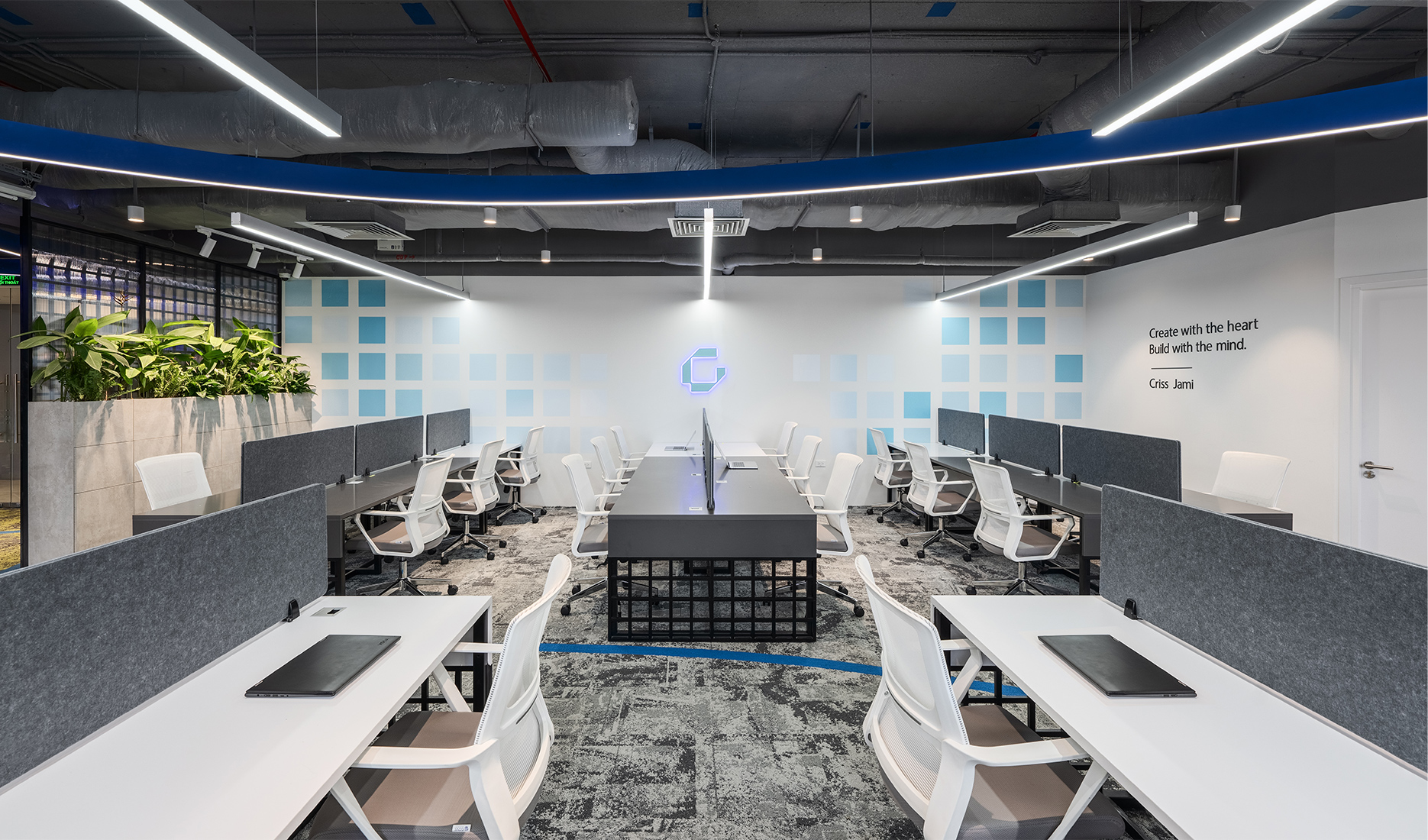
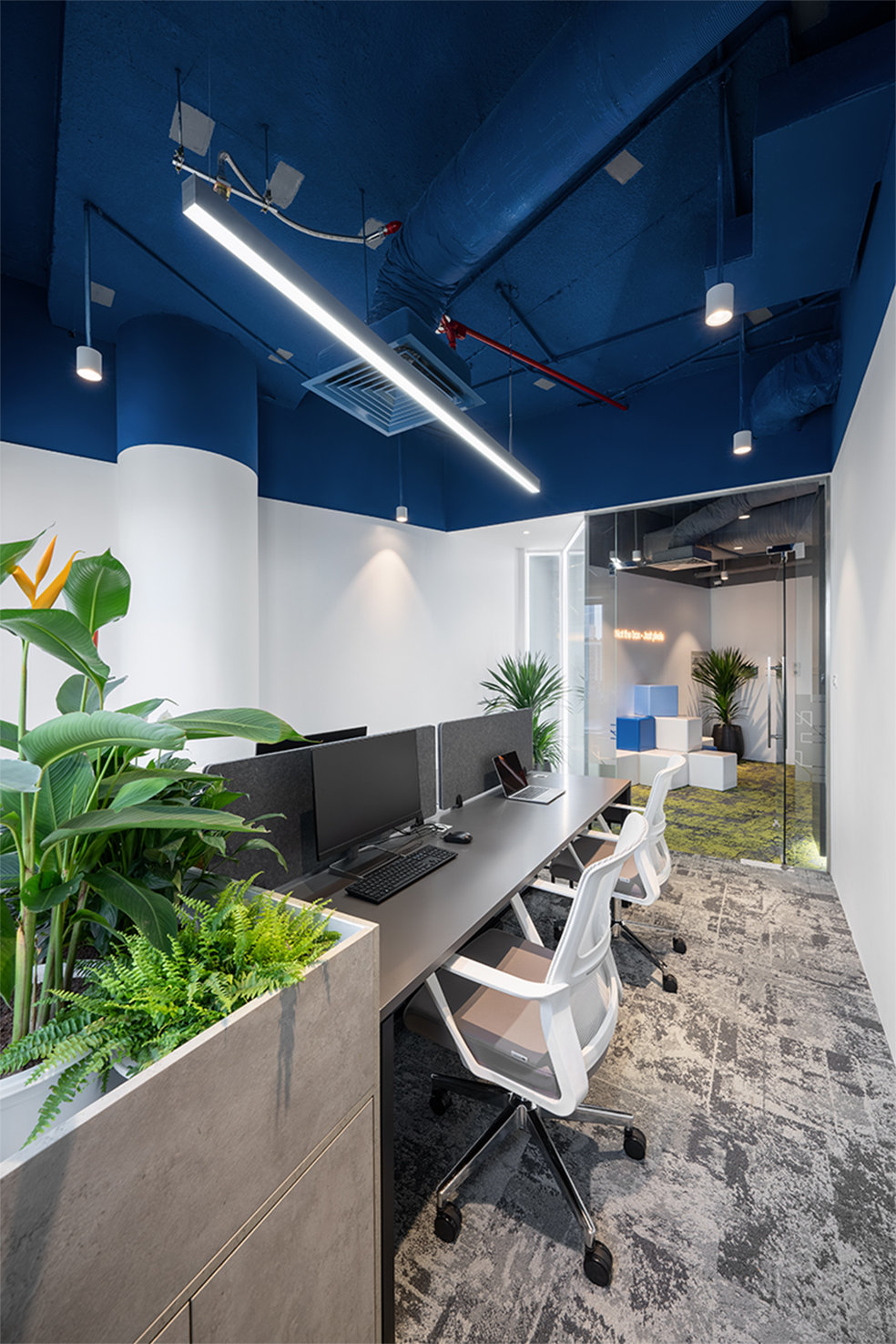
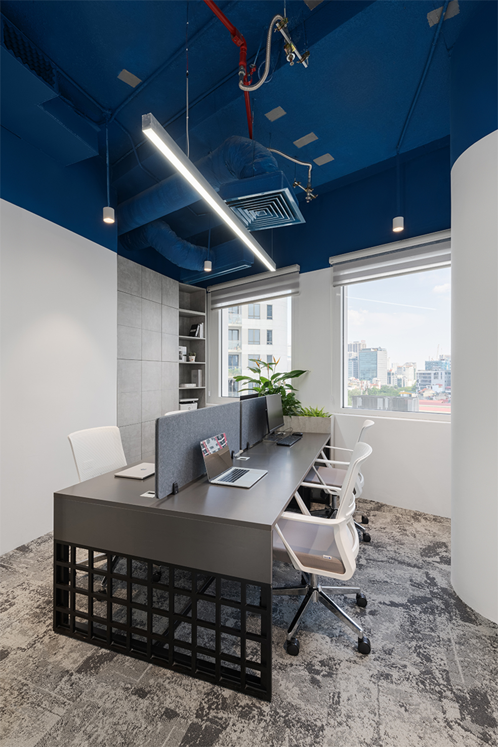
- The workspace is located in the middle, where there is the largest area of natural light.
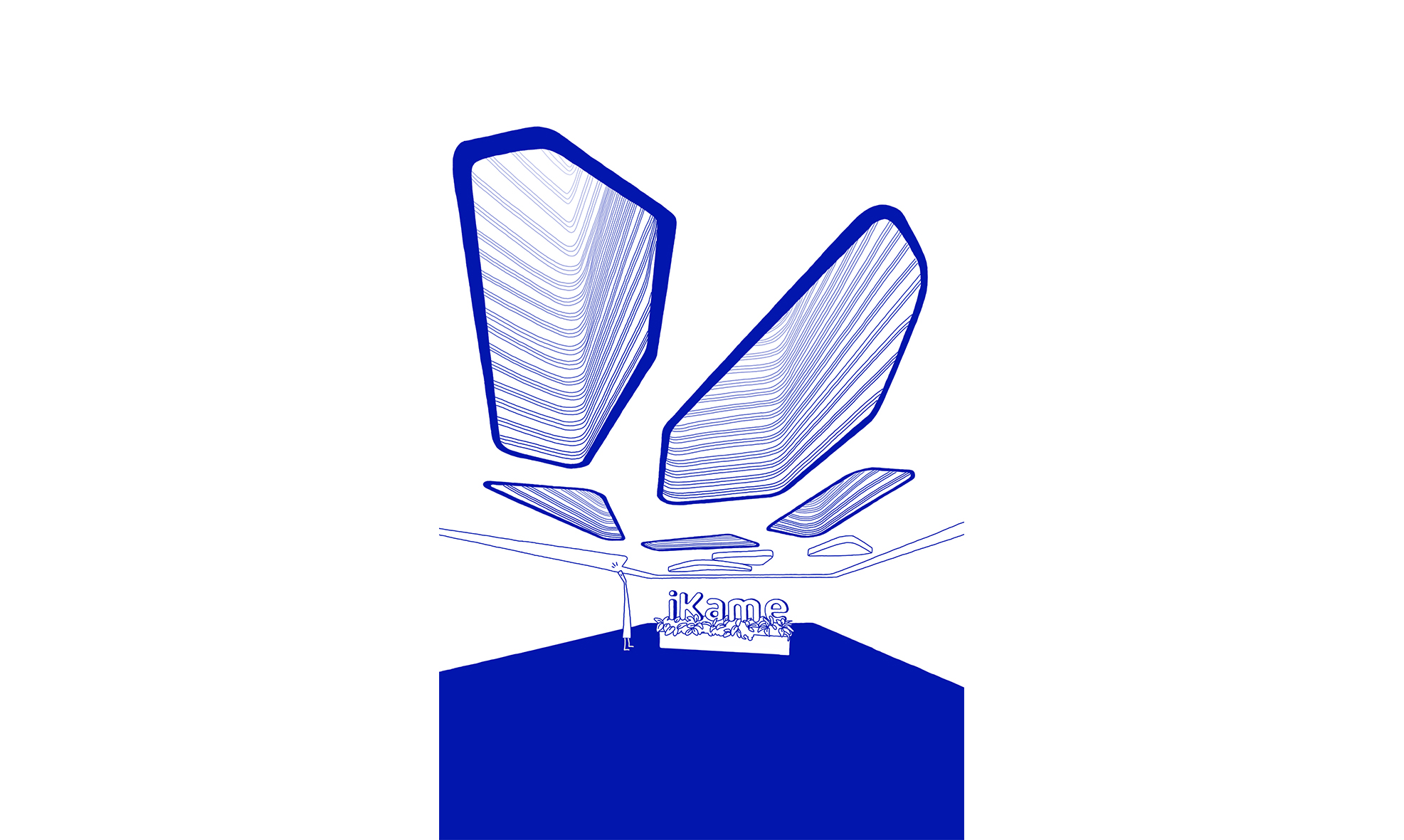
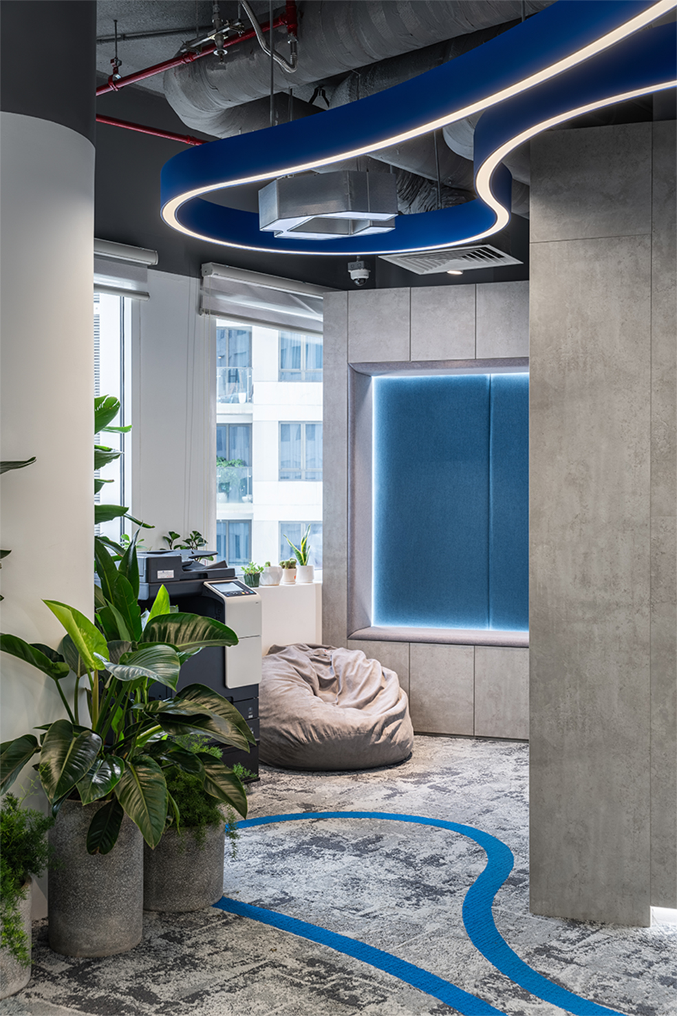
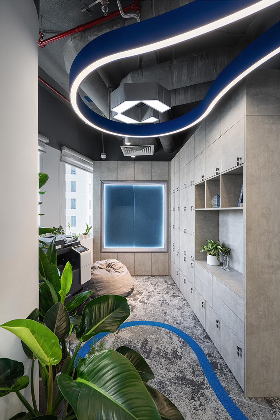
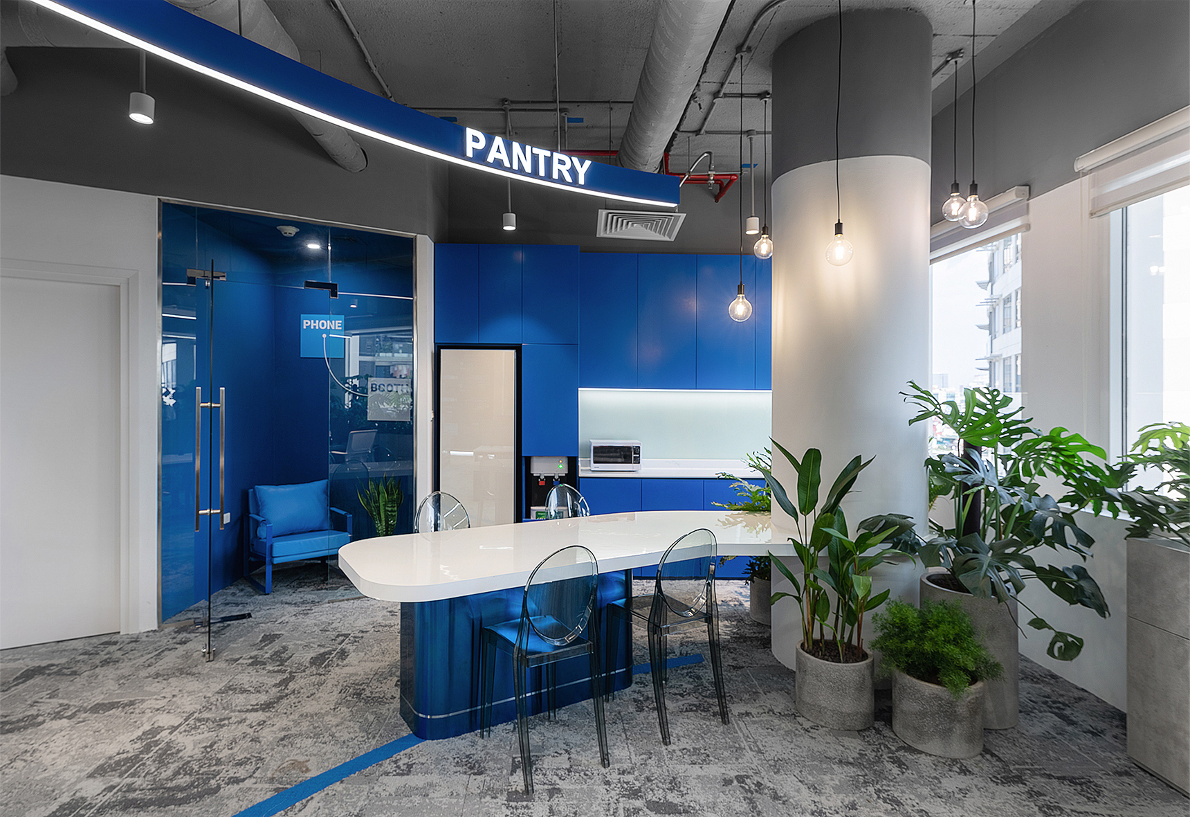
- Additional areas, such as the pantry and green space, will be the ending and create an interesting highlight for the workspace.
- The green factor exploited and put into the project by DPLUS ensures the creation of an airy, fresh, friendly, and inspiring working space.
Design style
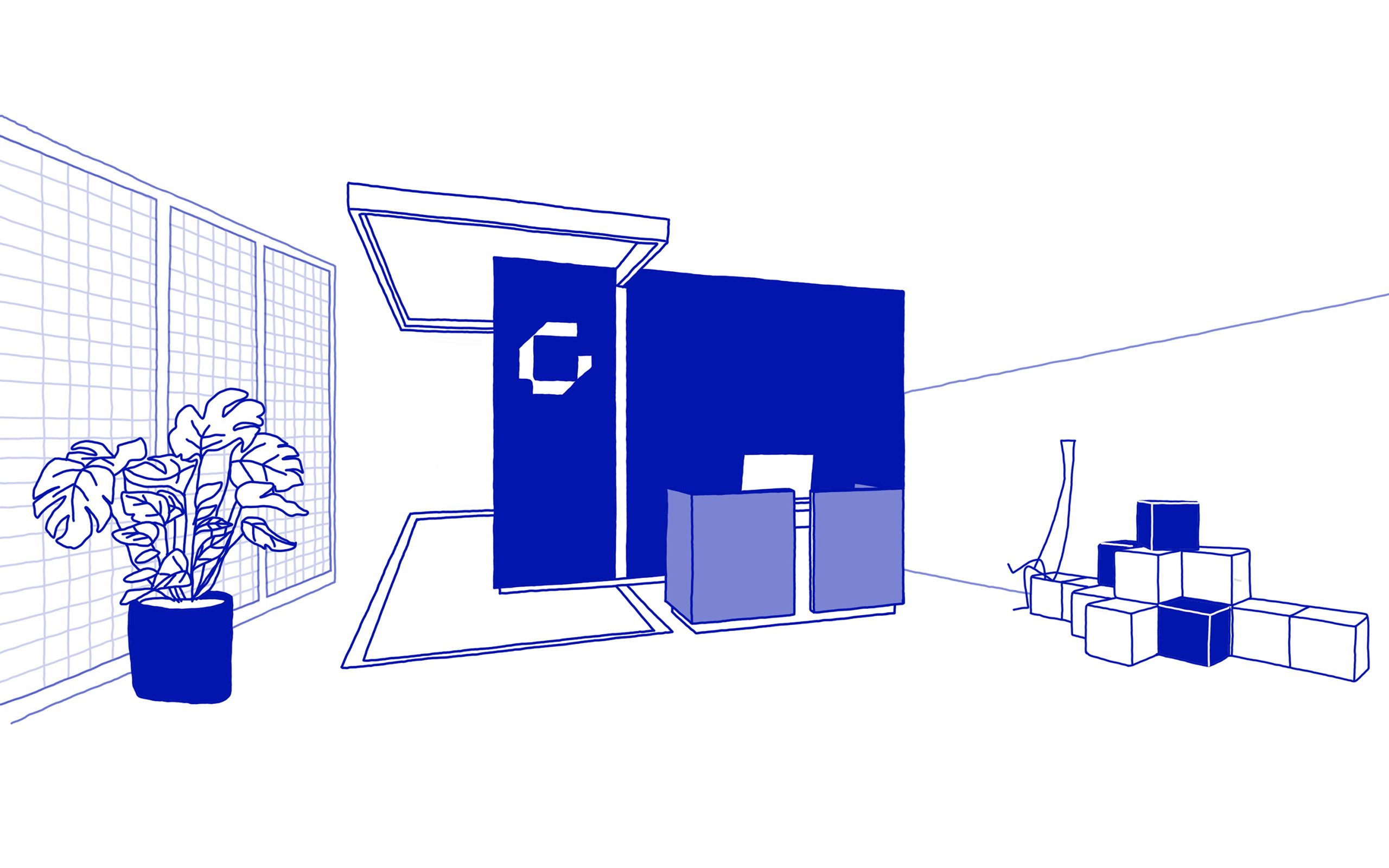
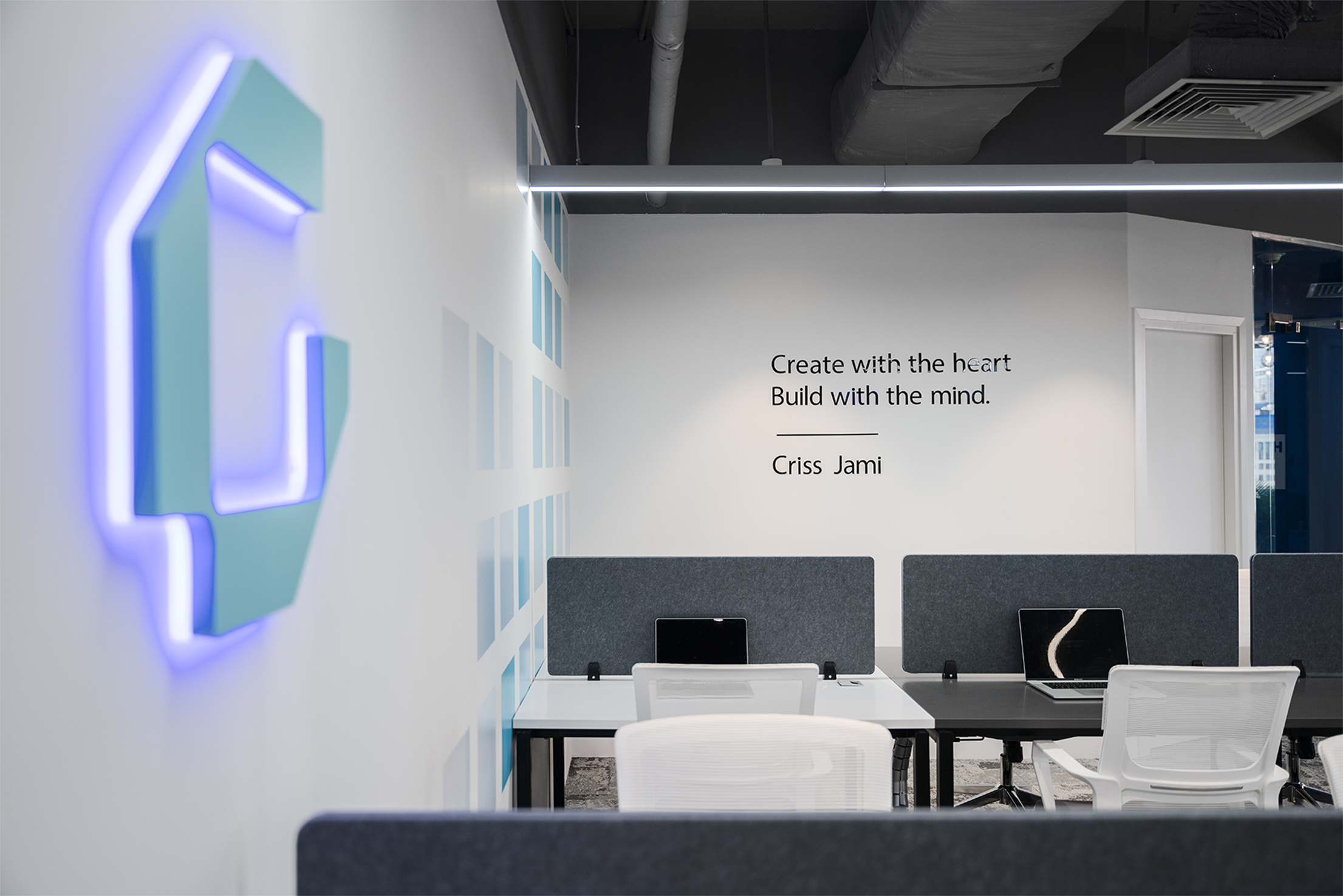
From the overall lines to the details of the project, all of the projects follow the general principles of the minimalist modern style: simplicity, elegance, limited colors, and complex lines, combined with green space to add more positive energy to the office.
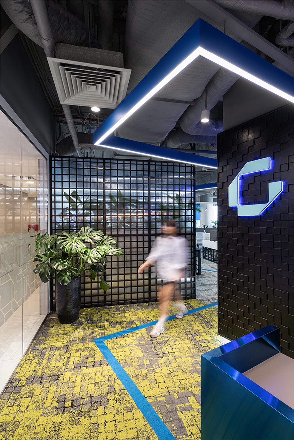
Geometric elements (squares, cubes) are exploited mainly in the design to create balance and navigation; the space is linked by a flexible and winding path from the entrance leading to the pantry. The soft path, in contrast to the square shape, creates a gentle movement through each interaction point in the space. Interaction in the workplace always has a positive impact, and the interaction process is more effective if there are scenarios to encourage it to happen more frequently.
Color
60% white – 30% gray and black – 10% blue
- White is the main color of the project, accounting for 60%, creating a subtle, minimalistic, and less distracting workspace, mainly used for walls, rough ceilings, and furniture.
- Gray and black are used as contrasting colors for the background to make the space clearer in terms of color.
- Blue is a highlight in some crucial positions to increase brand recognition.