Business is people – culture is brand. You are the representative of the Hoa Binh Minh brand” – Hoa Binh Minh
DESIGN STYLE
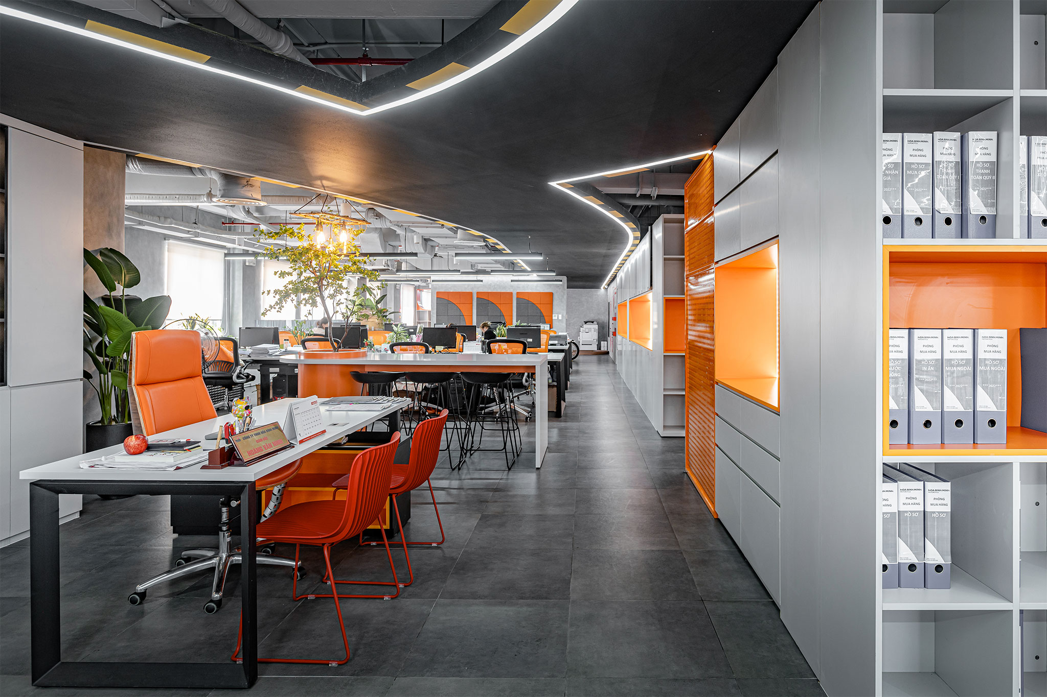
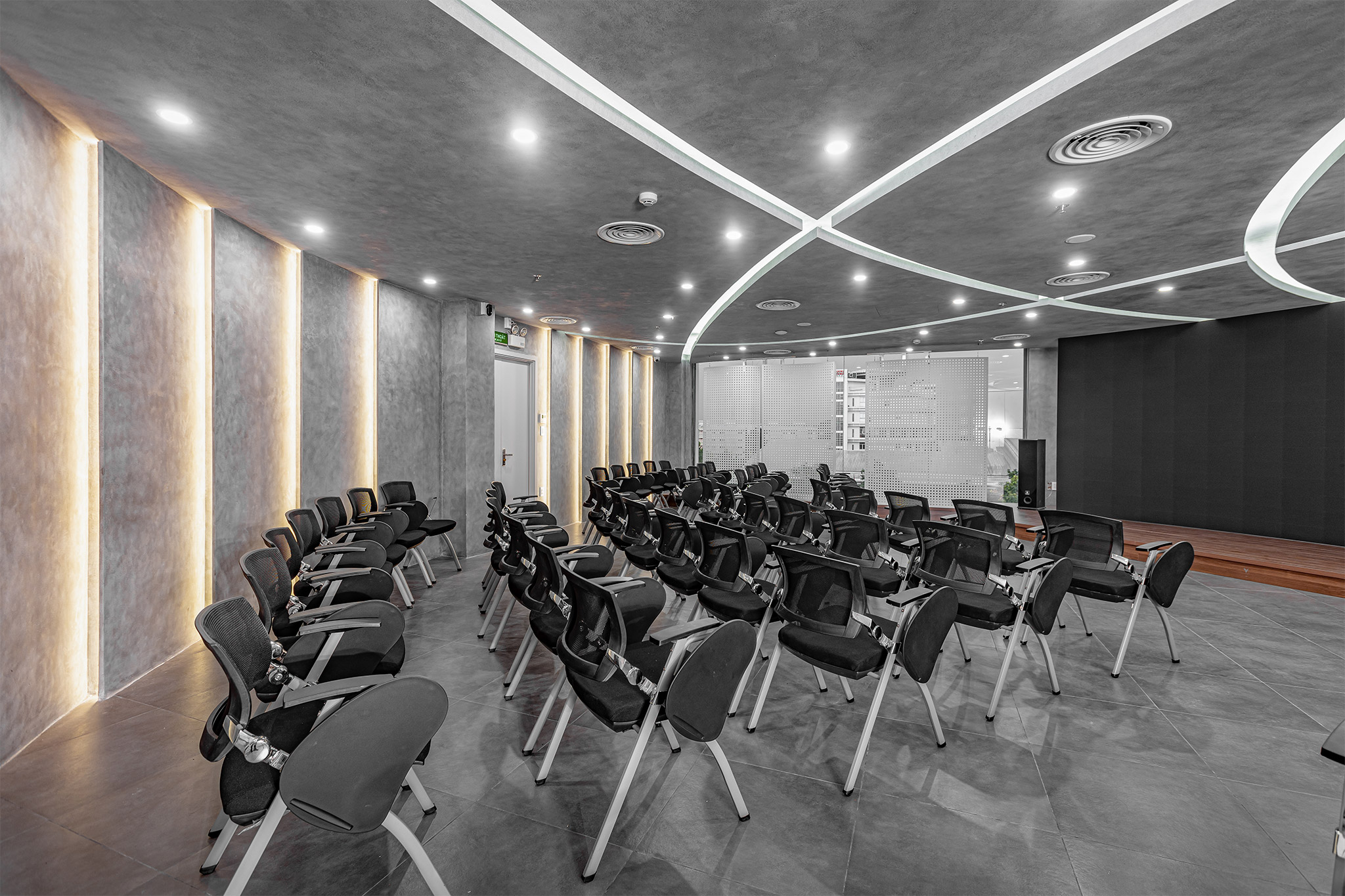
Using a modern design style to create a working space with the spirit of “passion in action” – dynamic, strong and decisive.
Modern language is clearly expressed through a minimalist, clean design with gentle curves, blocks and square, straight, coherent lines.
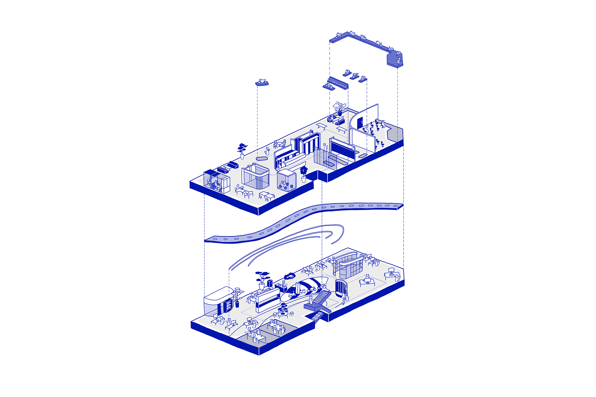
FLOOR PLAN
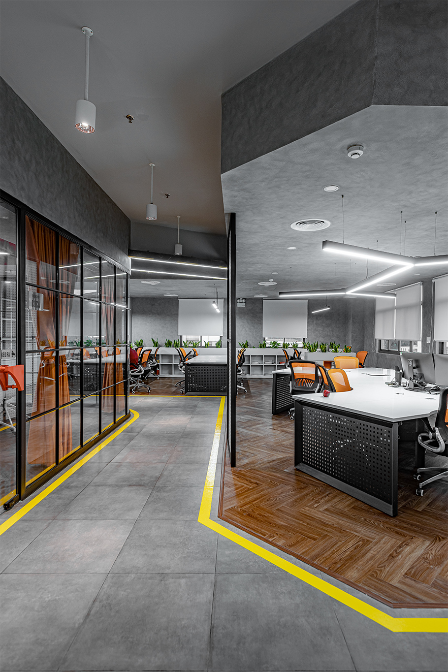
The space is clearly divided into functional zones.
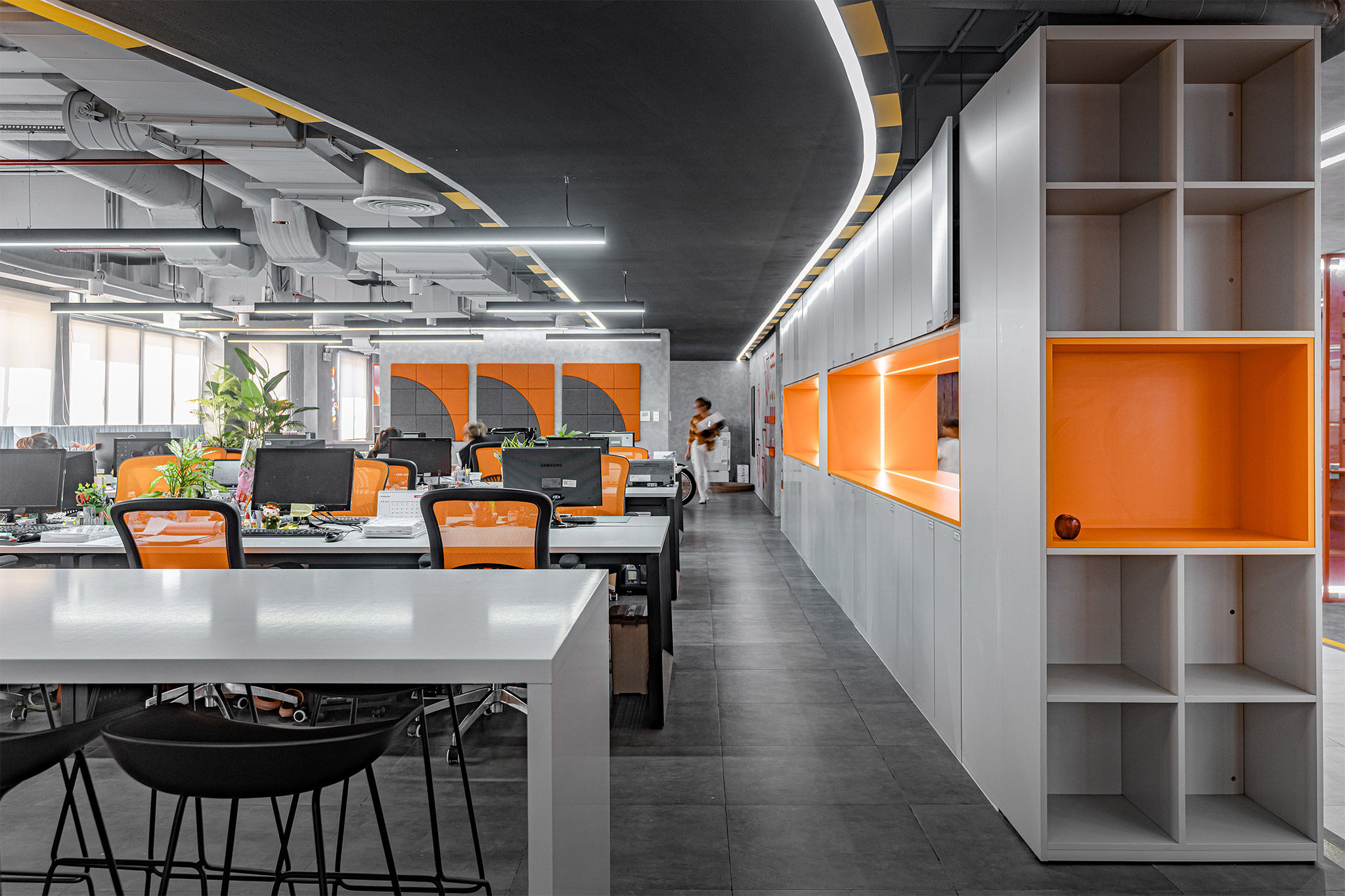
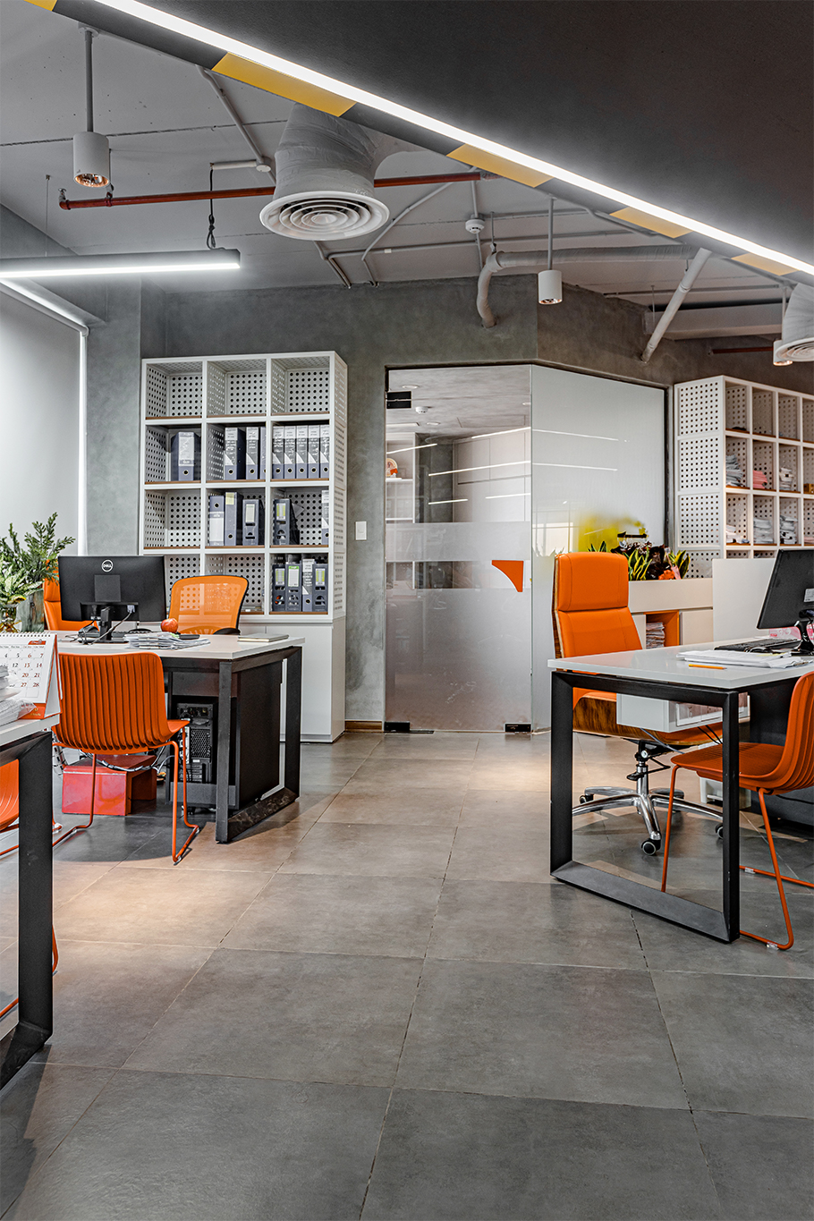
- All personal working spaces are placed at the outermost part, next to the window to balance natural and artificial light.
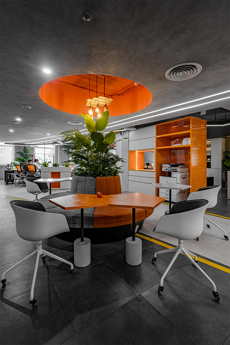
- Gradually towards the inside, in the central area are other functional spaces and interactive spaces.
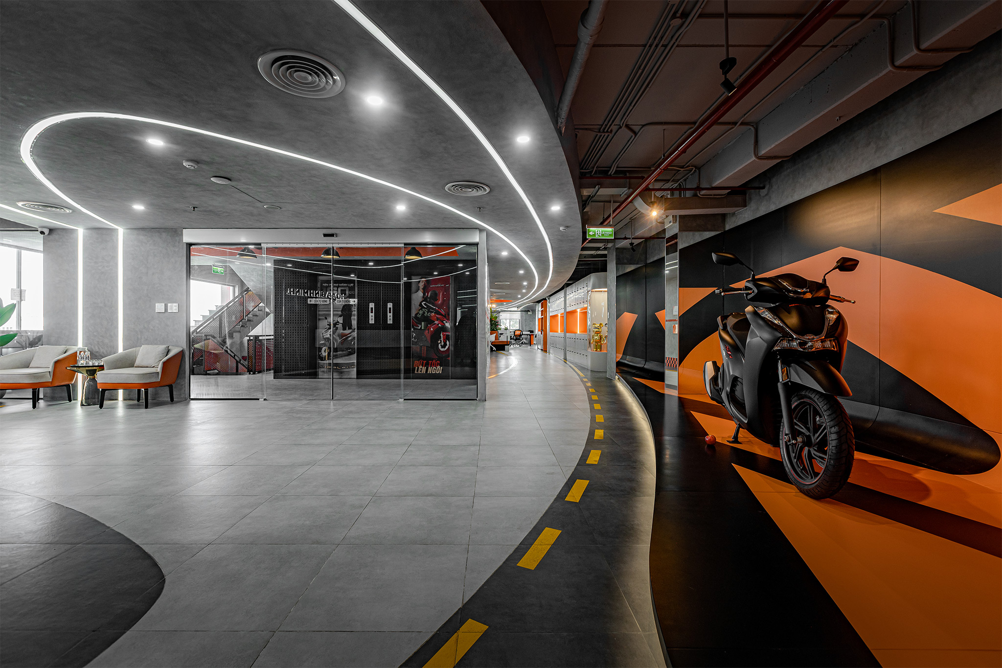
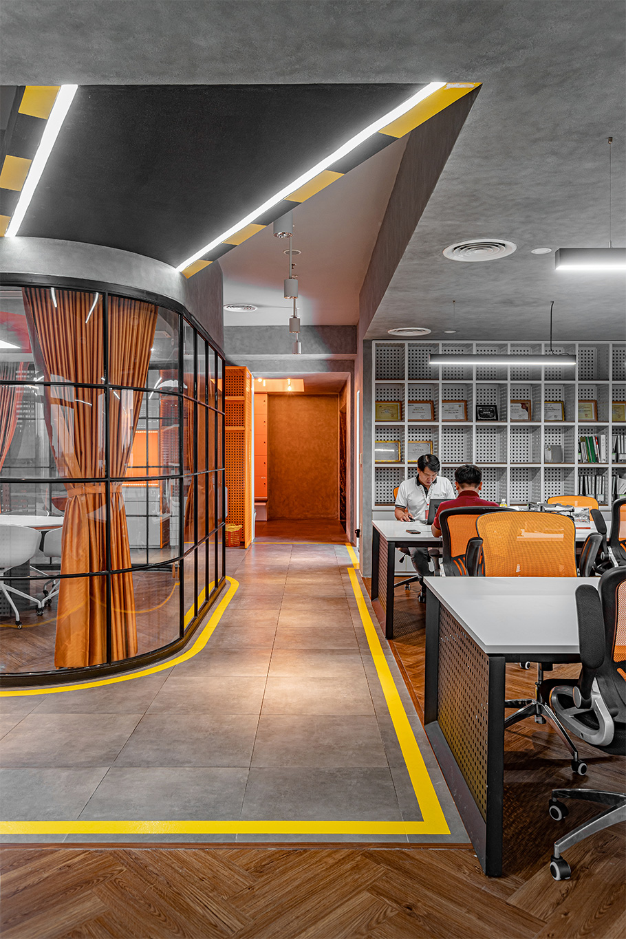
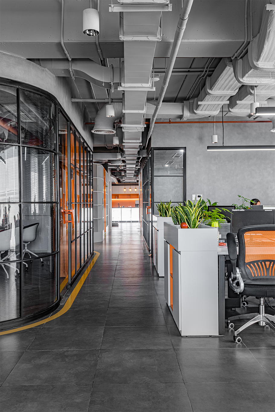
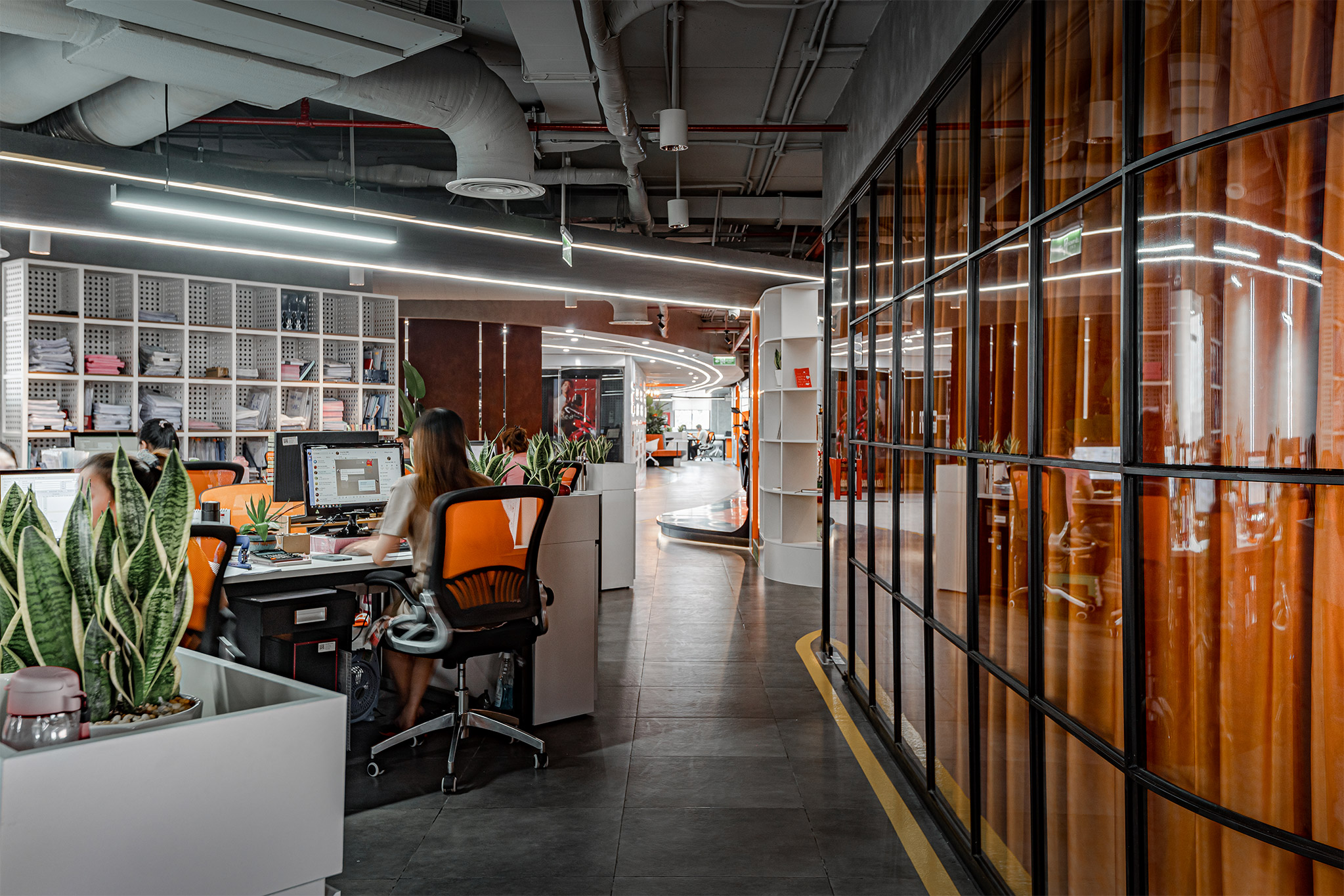
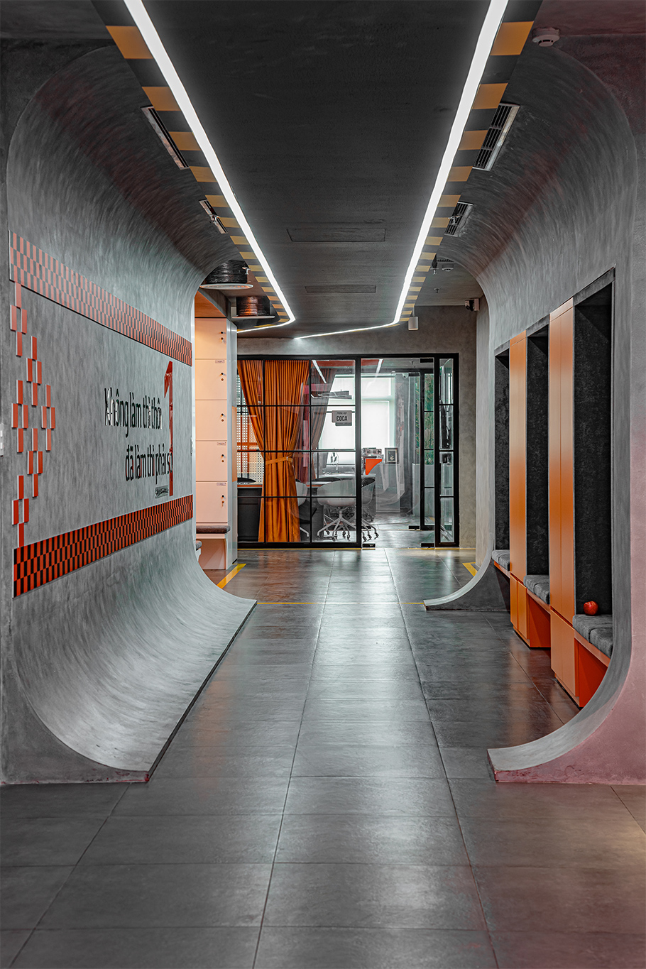
The corridor is designed to curve like a road, guiding to the office spaces. Looking at the floor plan design, the Hoa Binh Minh office space is like a miniature urban area.
DETAILS
Color
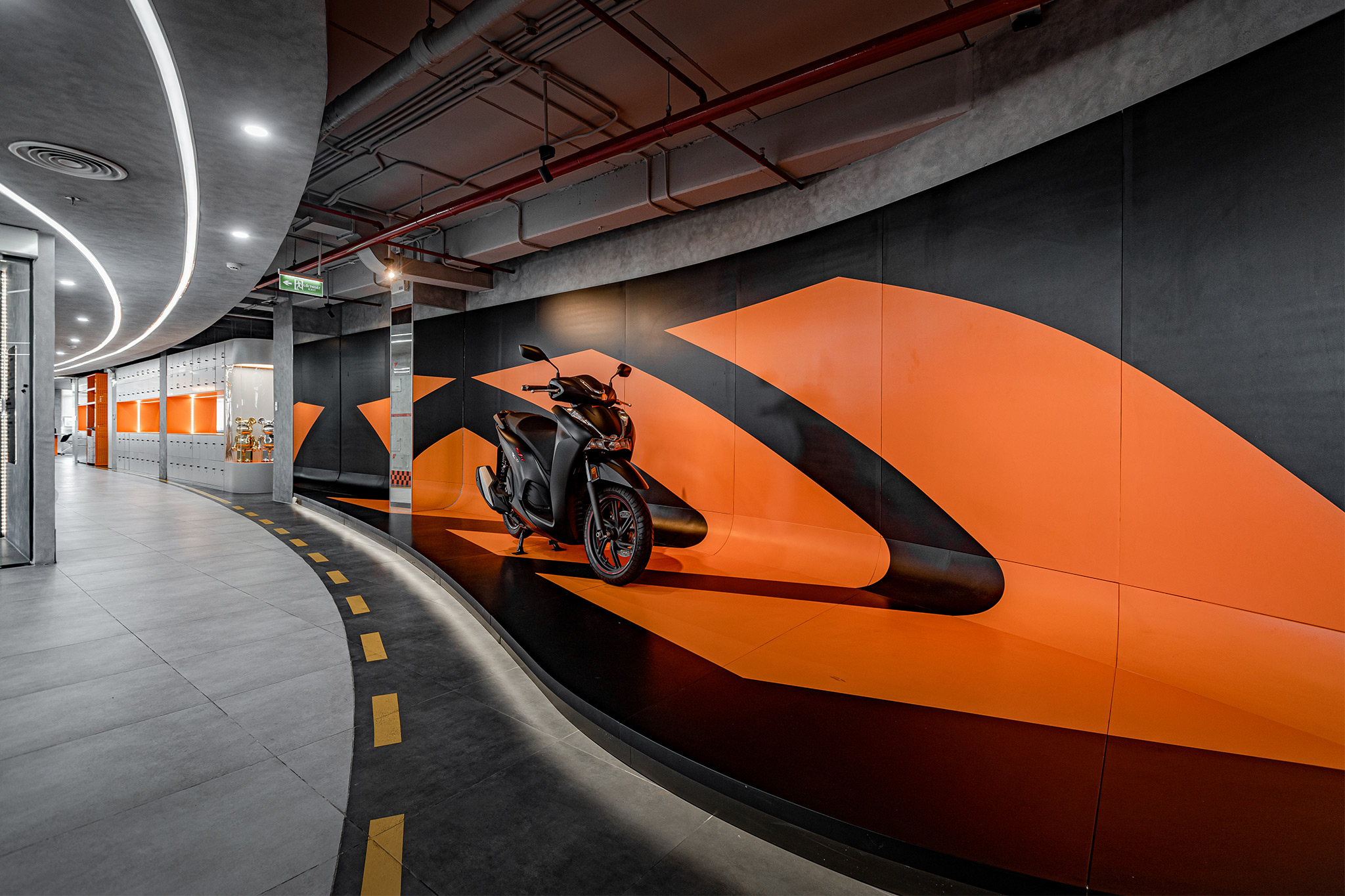
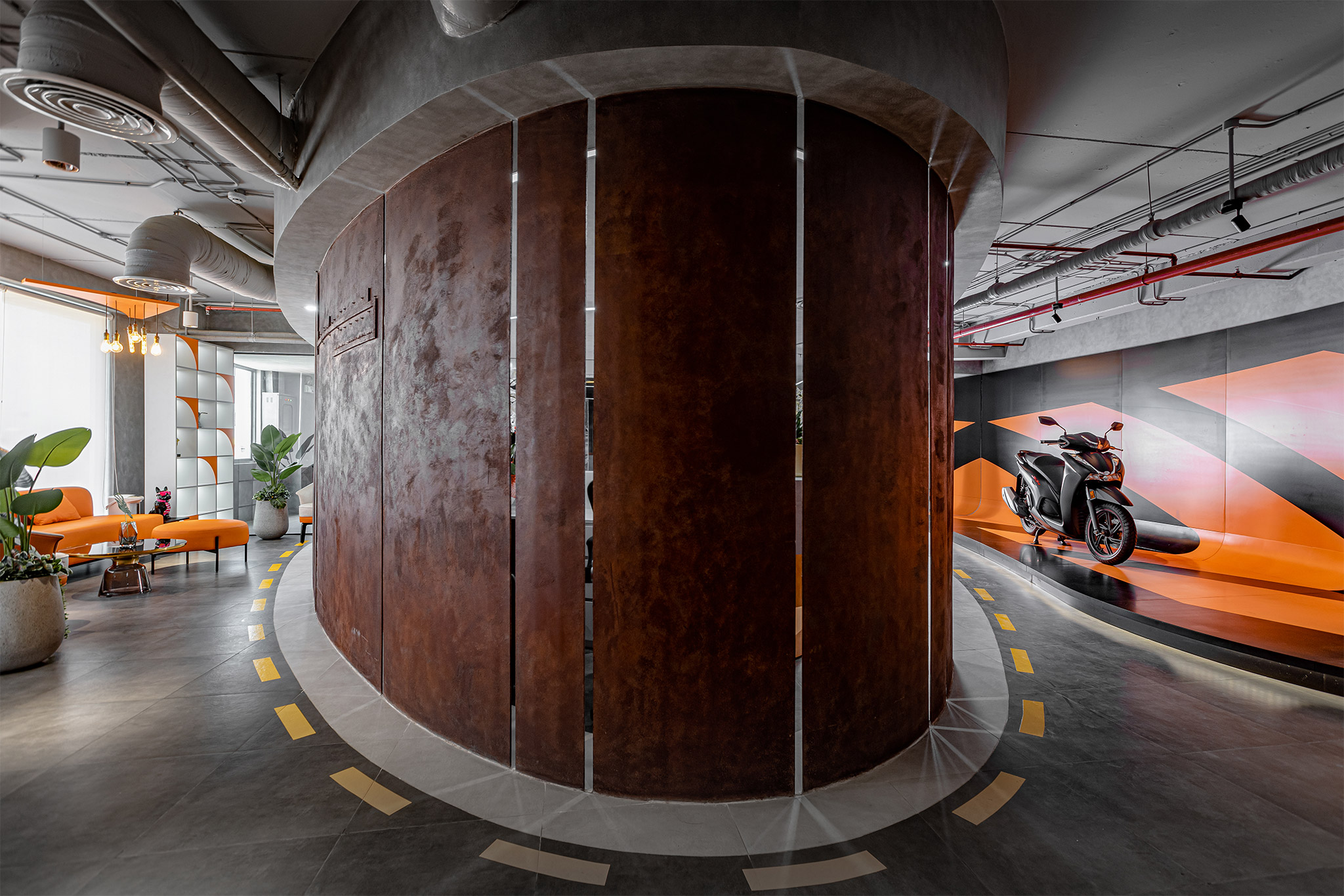
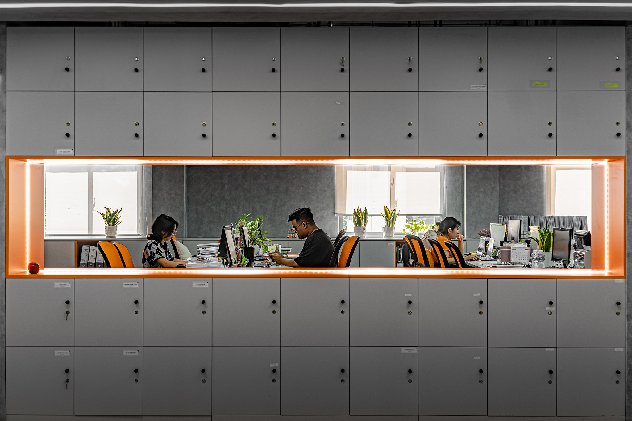
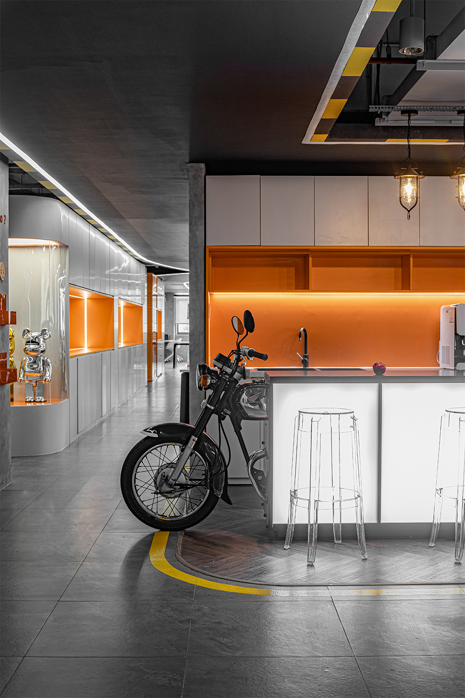
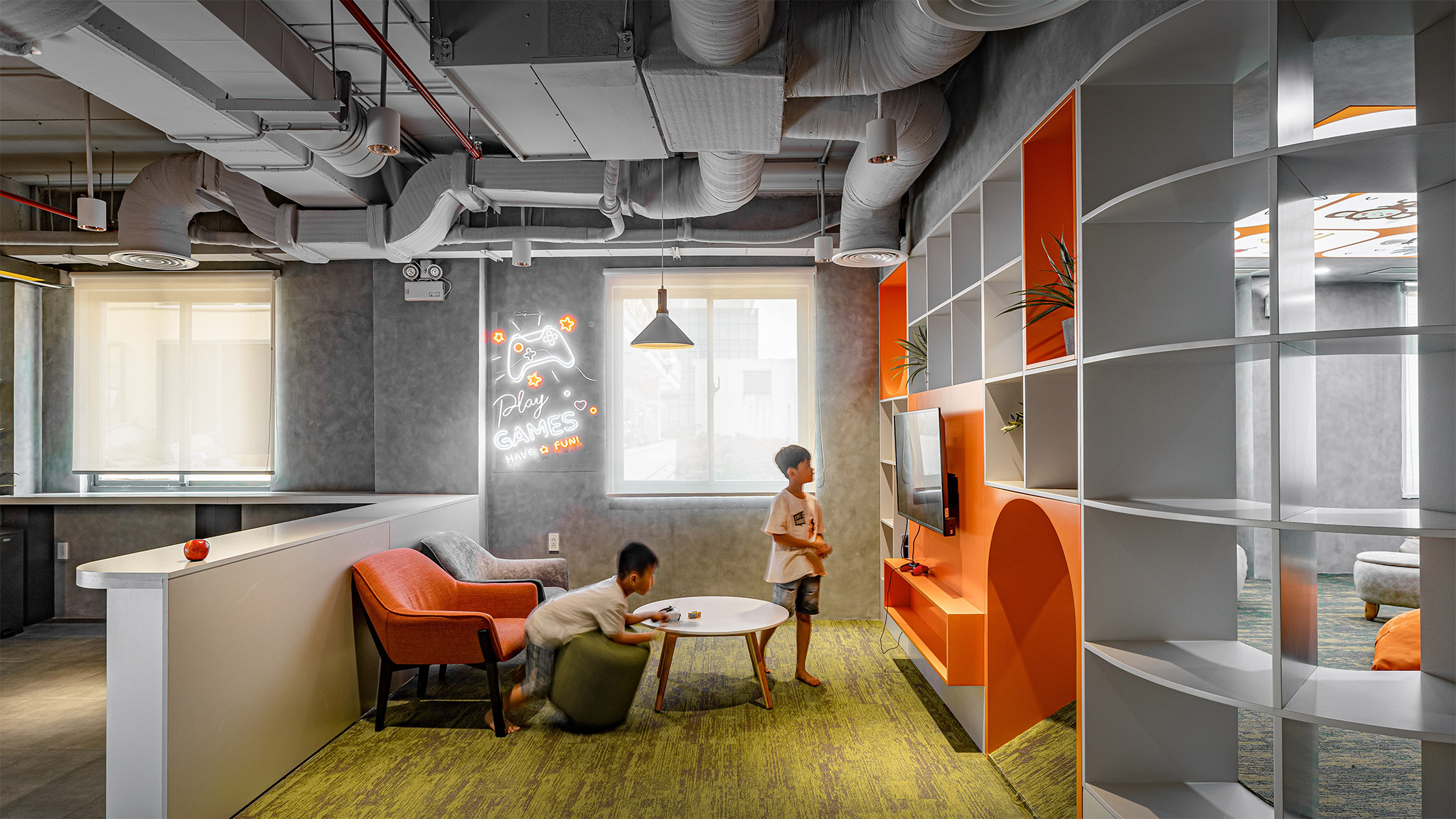
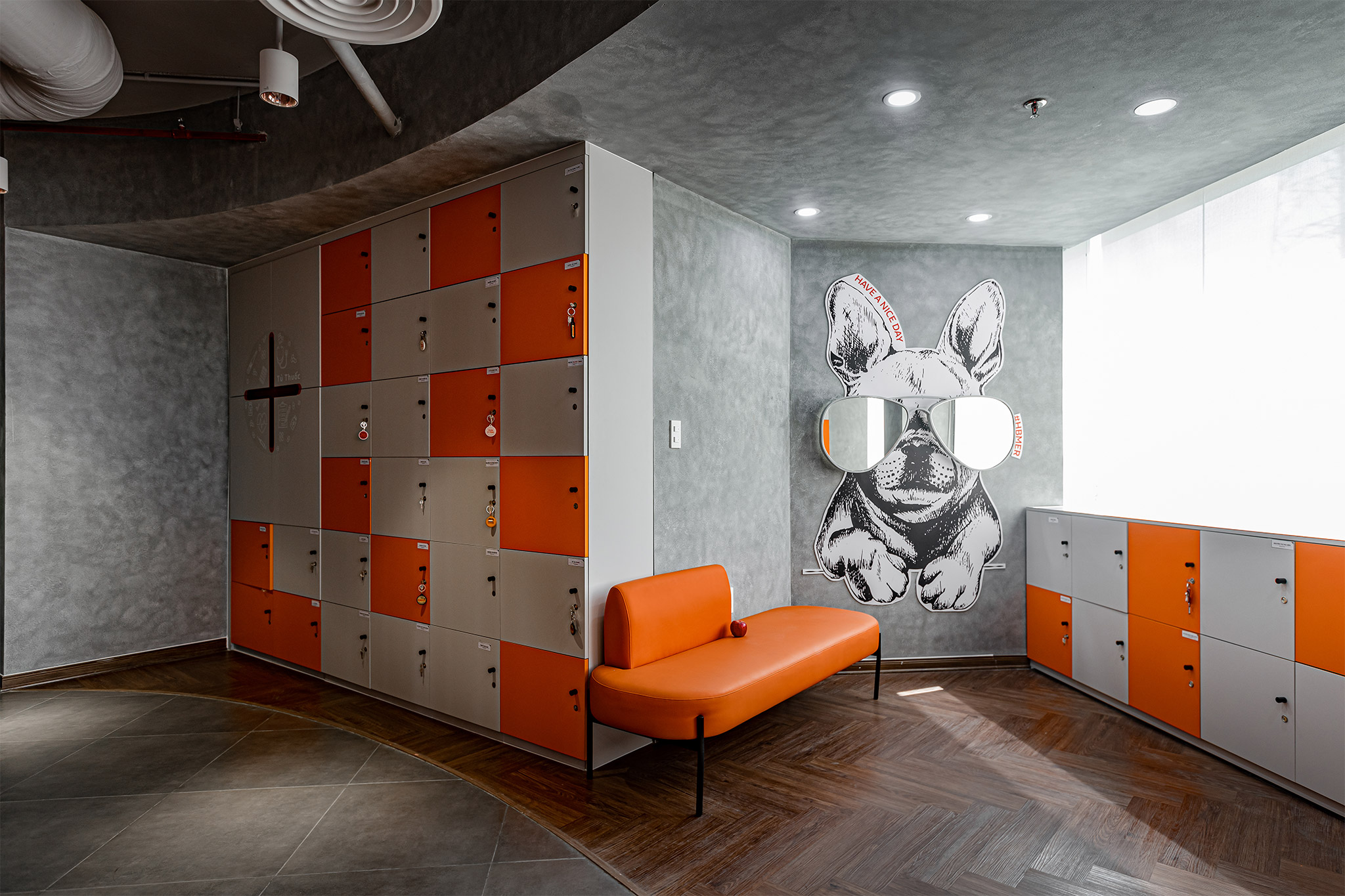
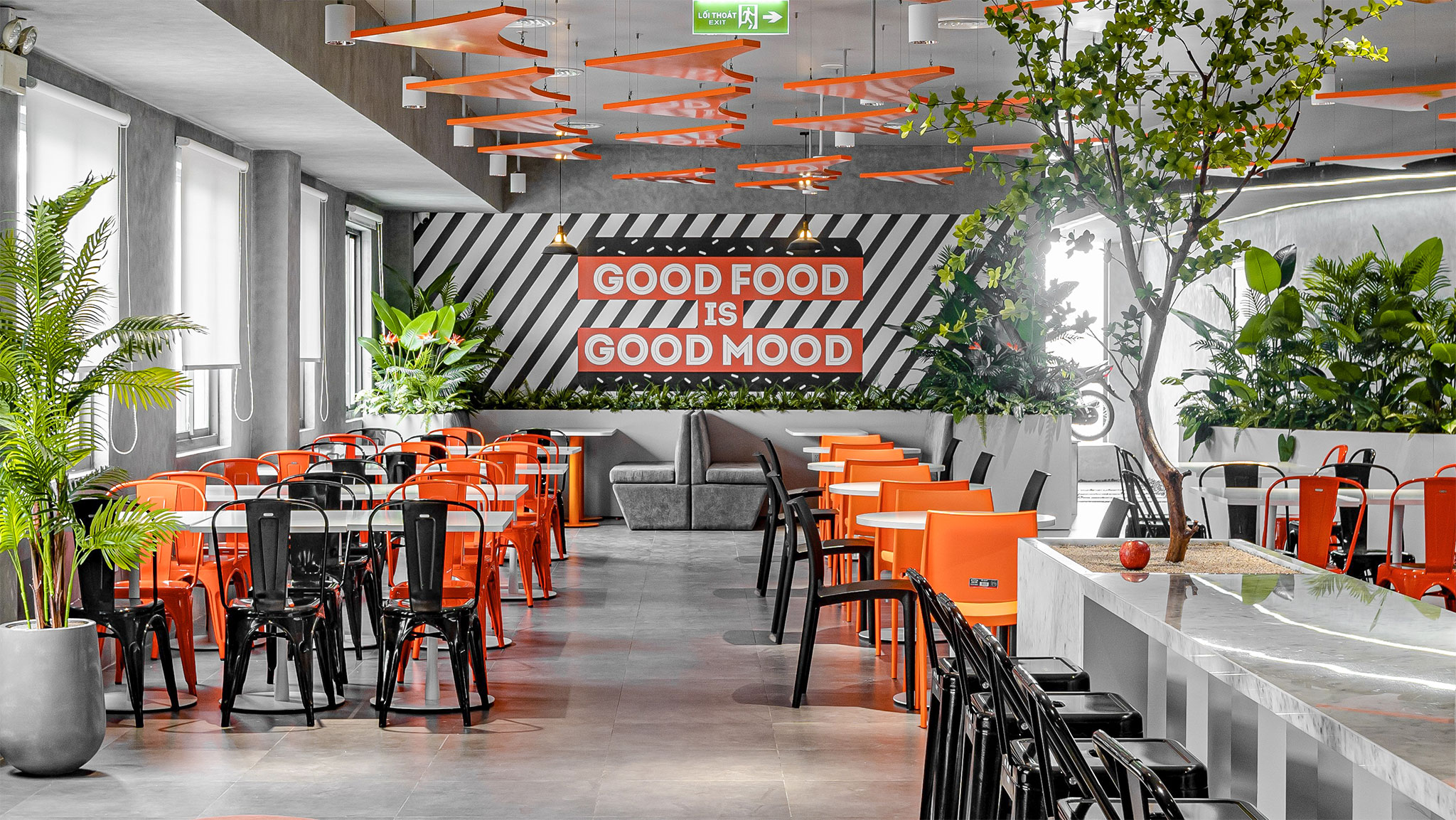
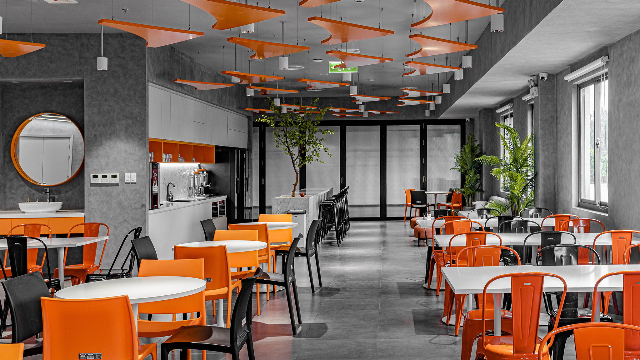
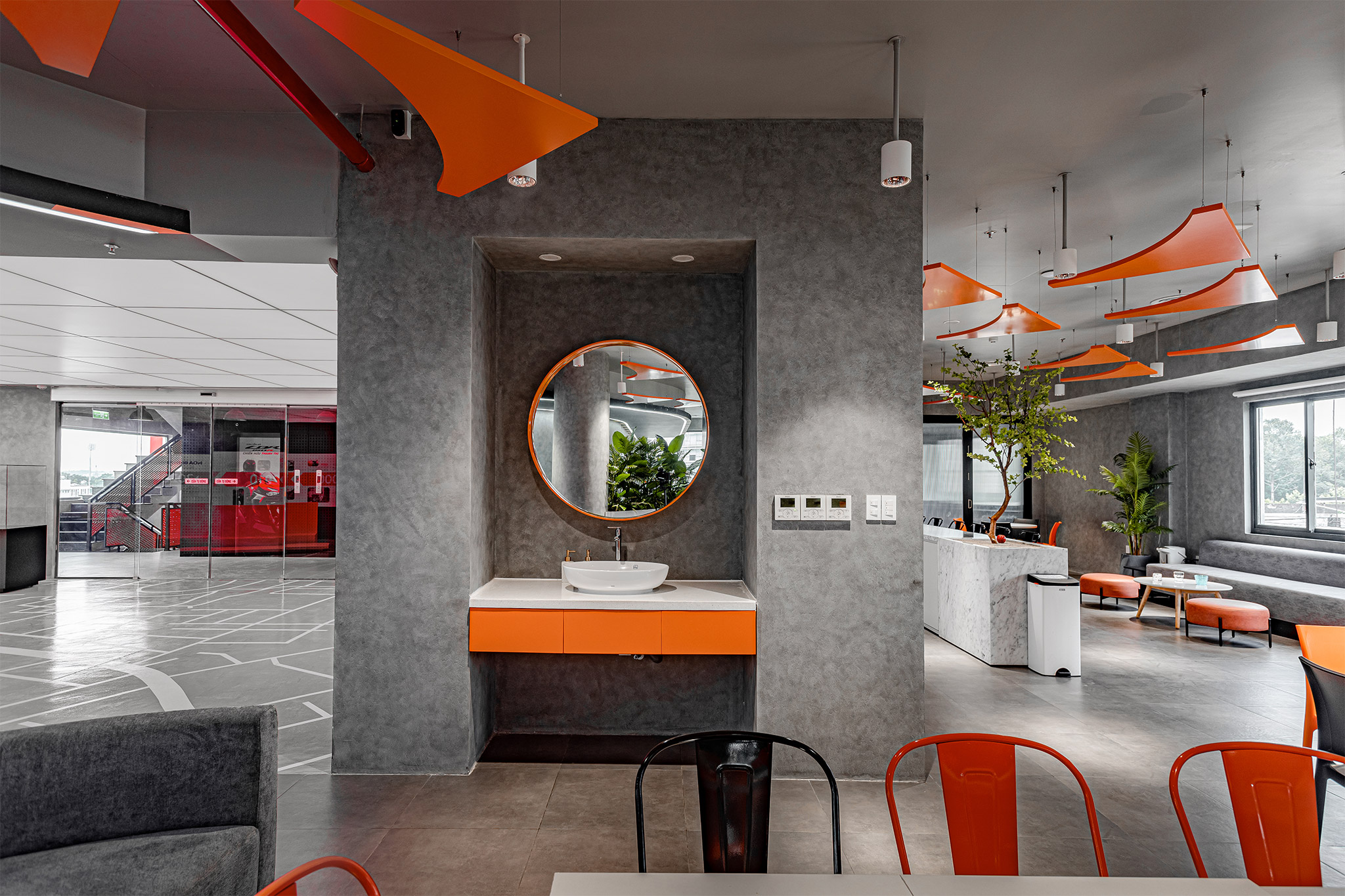
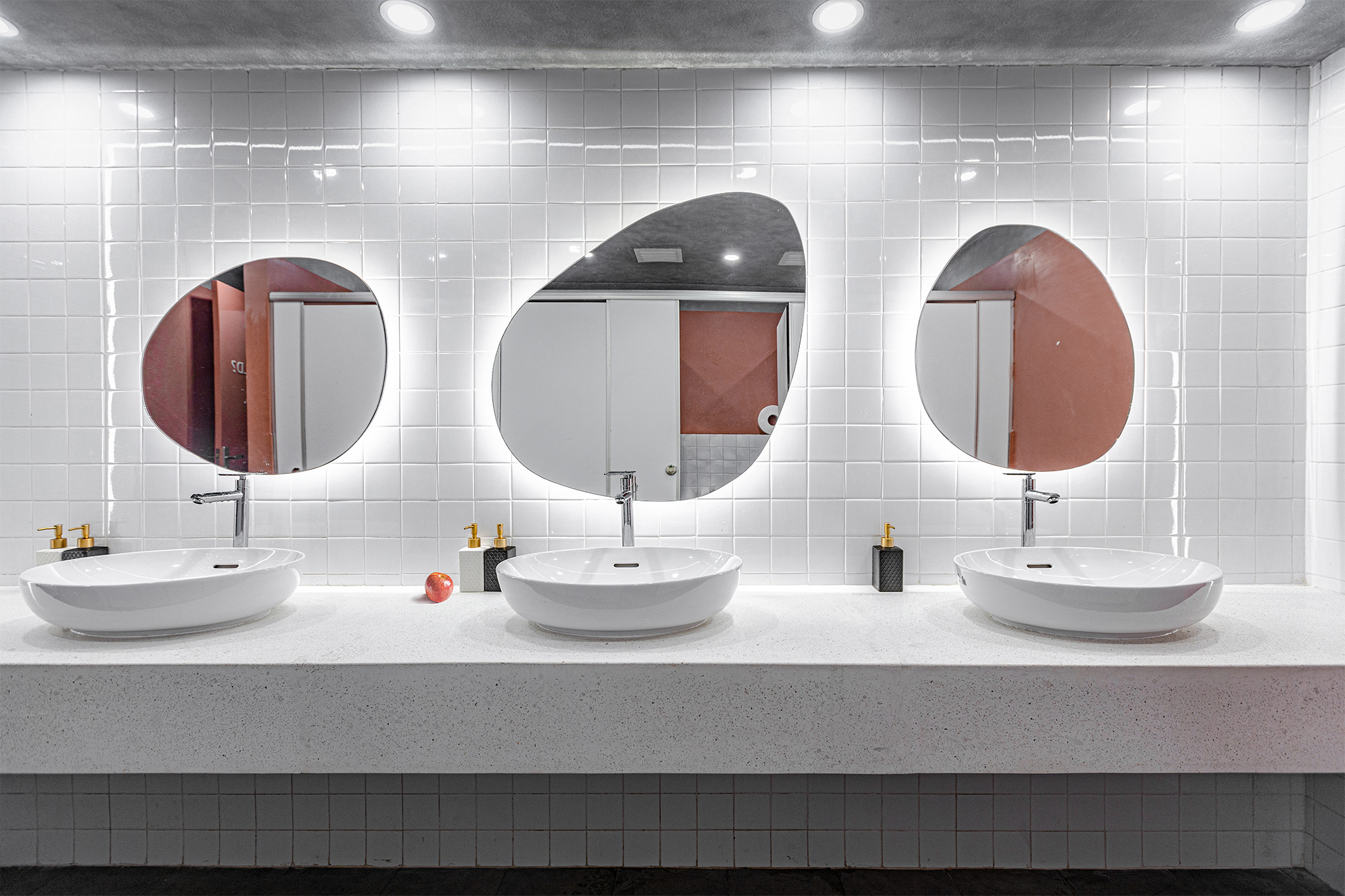
The contrast technique is thoroughly used in the coordination between the brand’s identity color pair (black-orange) and other tones.
The typical colors of modern style such as white, gray, black (neutral colors) are used as background colors, combined with orange, red, yellow – (brand identity colors) to create contrast and clear layering.
- Black represents formality, sustainability and longevity over time
- Orange-red represents enthusiasm, determination and passion.
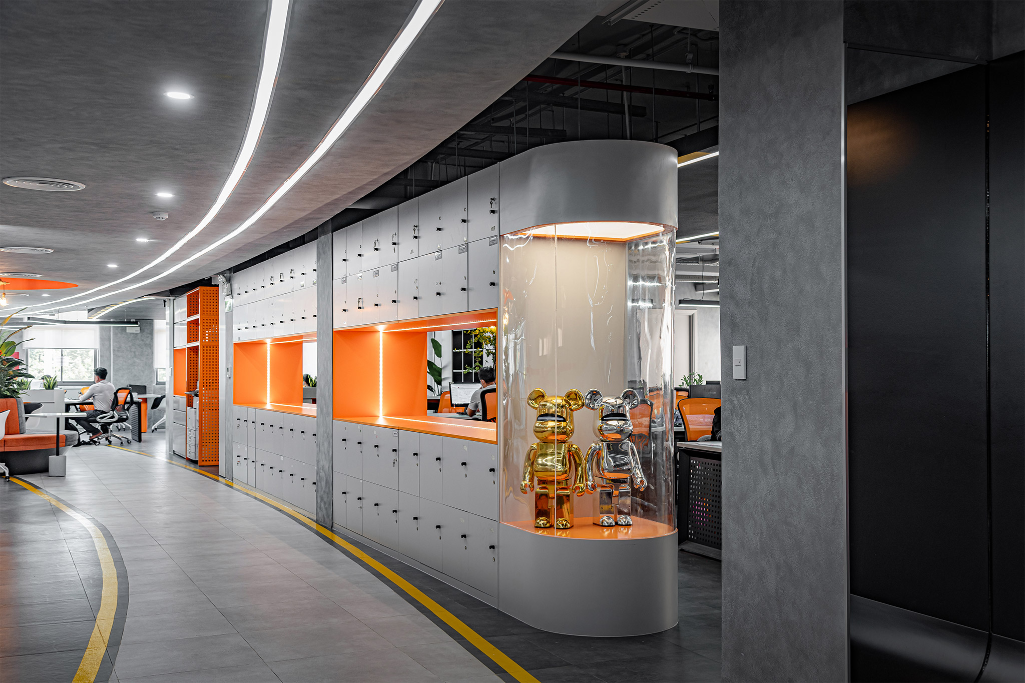
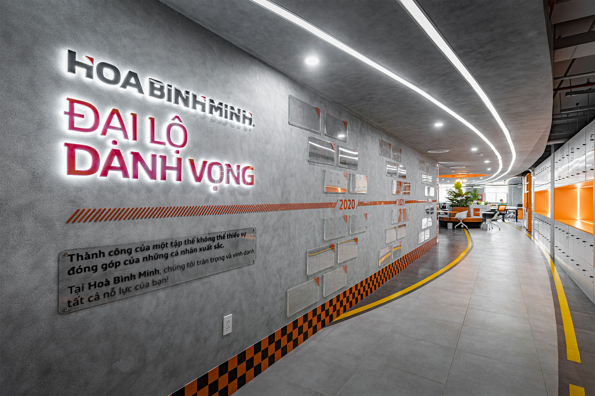
- Environmental Graphic
The spatial graphic design (Environmental Graphic) is a special highlight that DPLUS applied in this project.
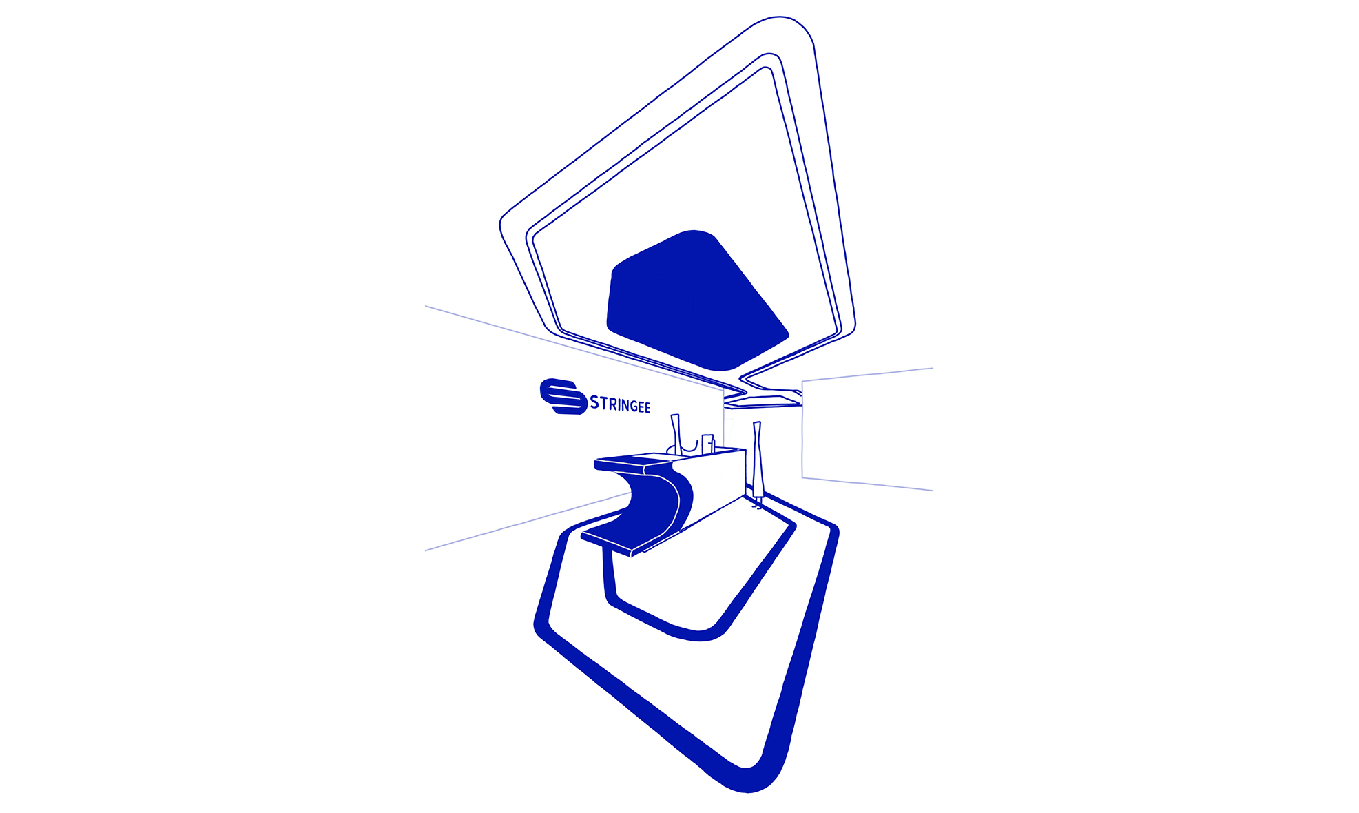
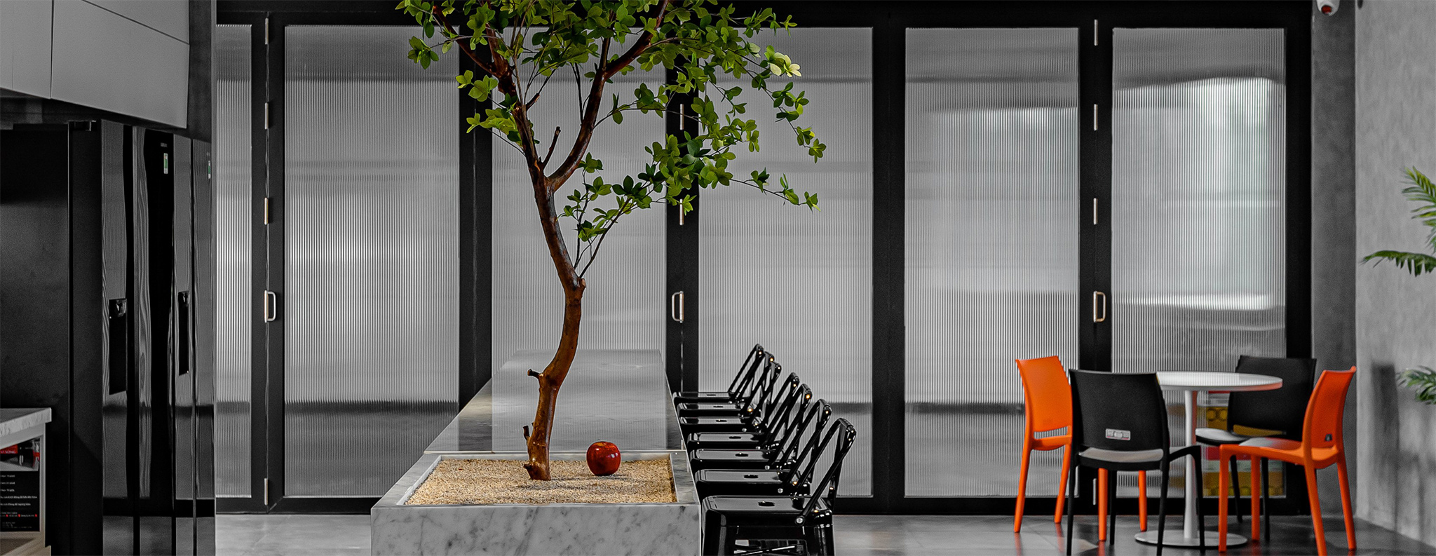
The image of the road
Right in the middle of the space combined with the ceiling system creates soft curves, leading users through different areas of the office.
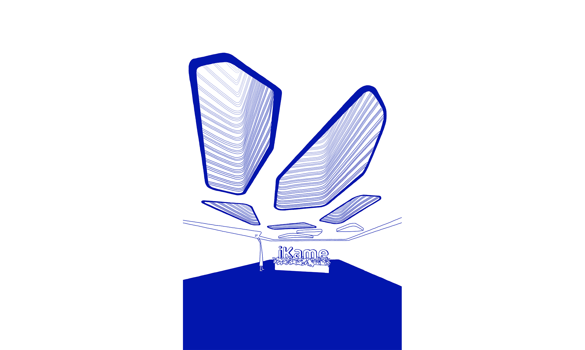
Ceiling panels
The ceiling panels in the pantry area are inspired by the brand’s logo. The stylized right triangle represents the combination of straight lines (characteristics “Honesty”) and curves (“Action-Energy”).
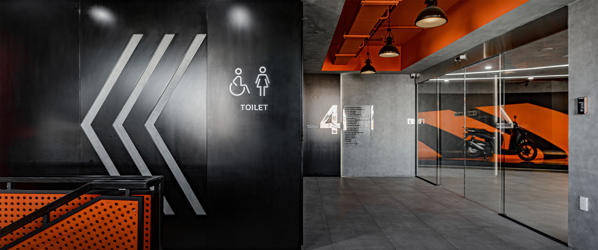
Exhibition
Using exhibitions (a form of environmental graphic design) in exhibition spaces to communicate the development and culture of the business, creating an interesting way for users to receive information.
Interactive experience
Interactive experience is a graphic design that helps increase the interaction between users and the space.
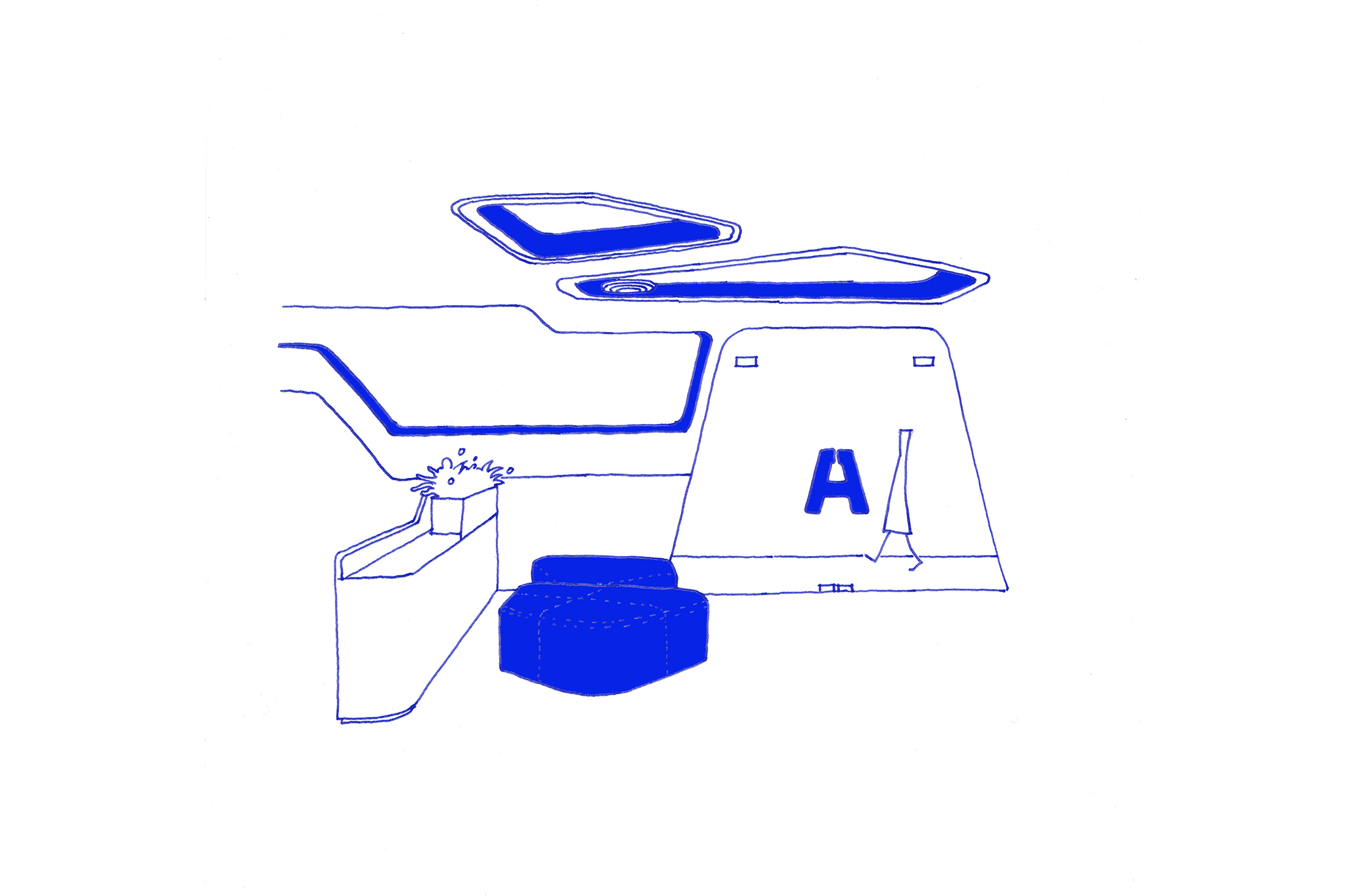
Recycling corners, maps on the floor, typography on the walls are typical applications of Interactive experience in the project, aiming at experience and bringing new emotions to users. From there, there is a multi-sensory interaction (visual, tactile) between people and space.
- Field: Motorcycle distribution
- Area: 1740m2
- Location: Dong Nai, Vietnam