
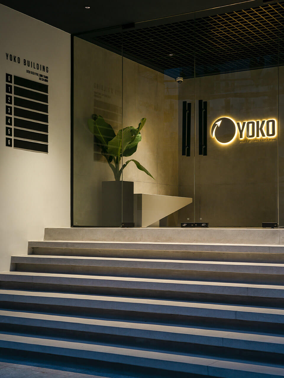
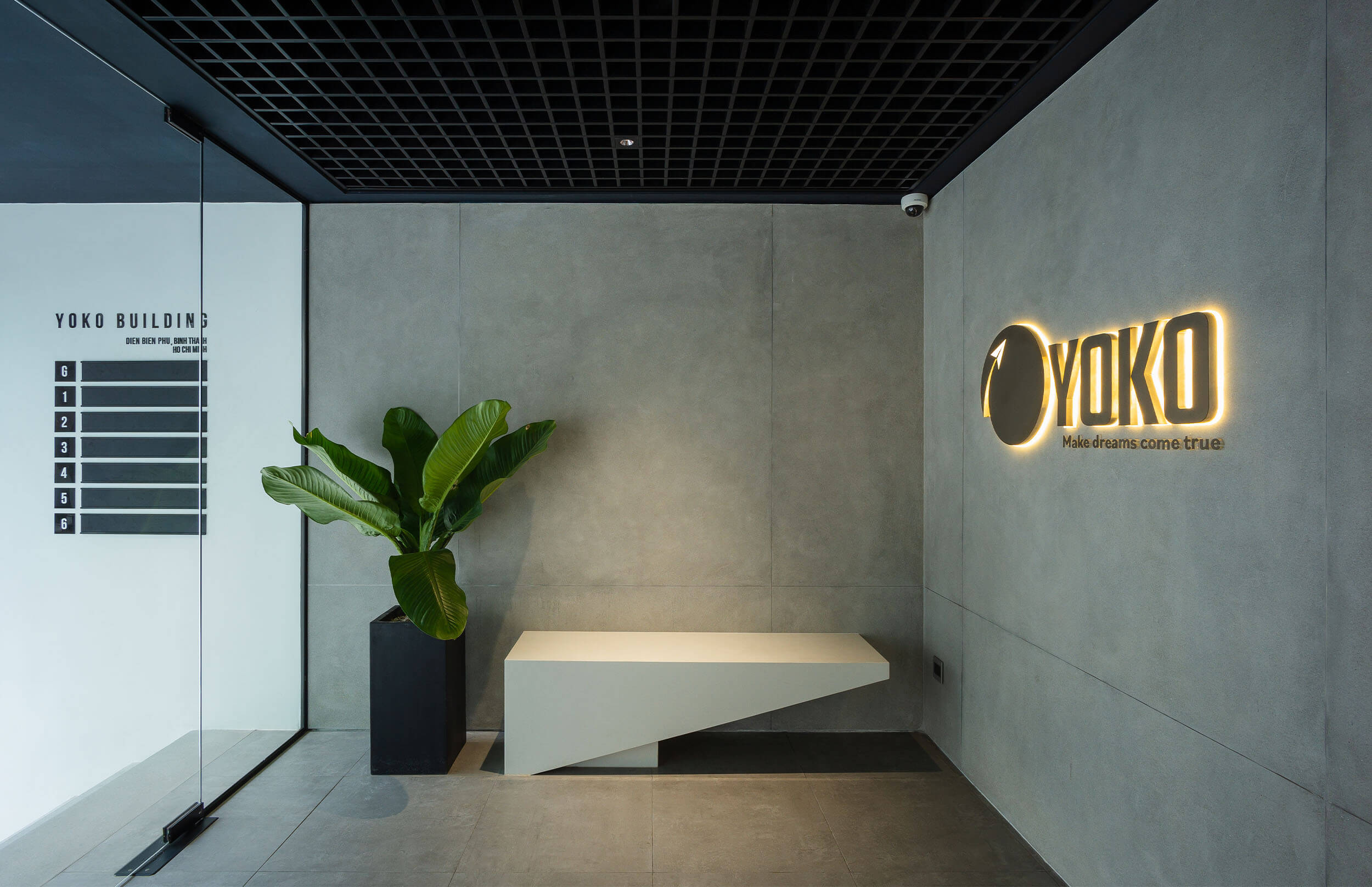
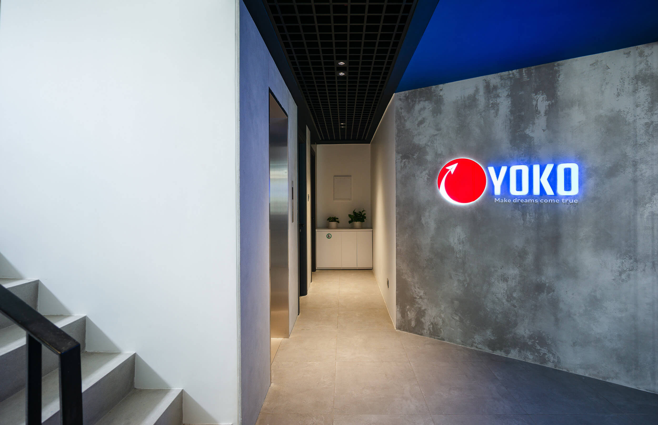
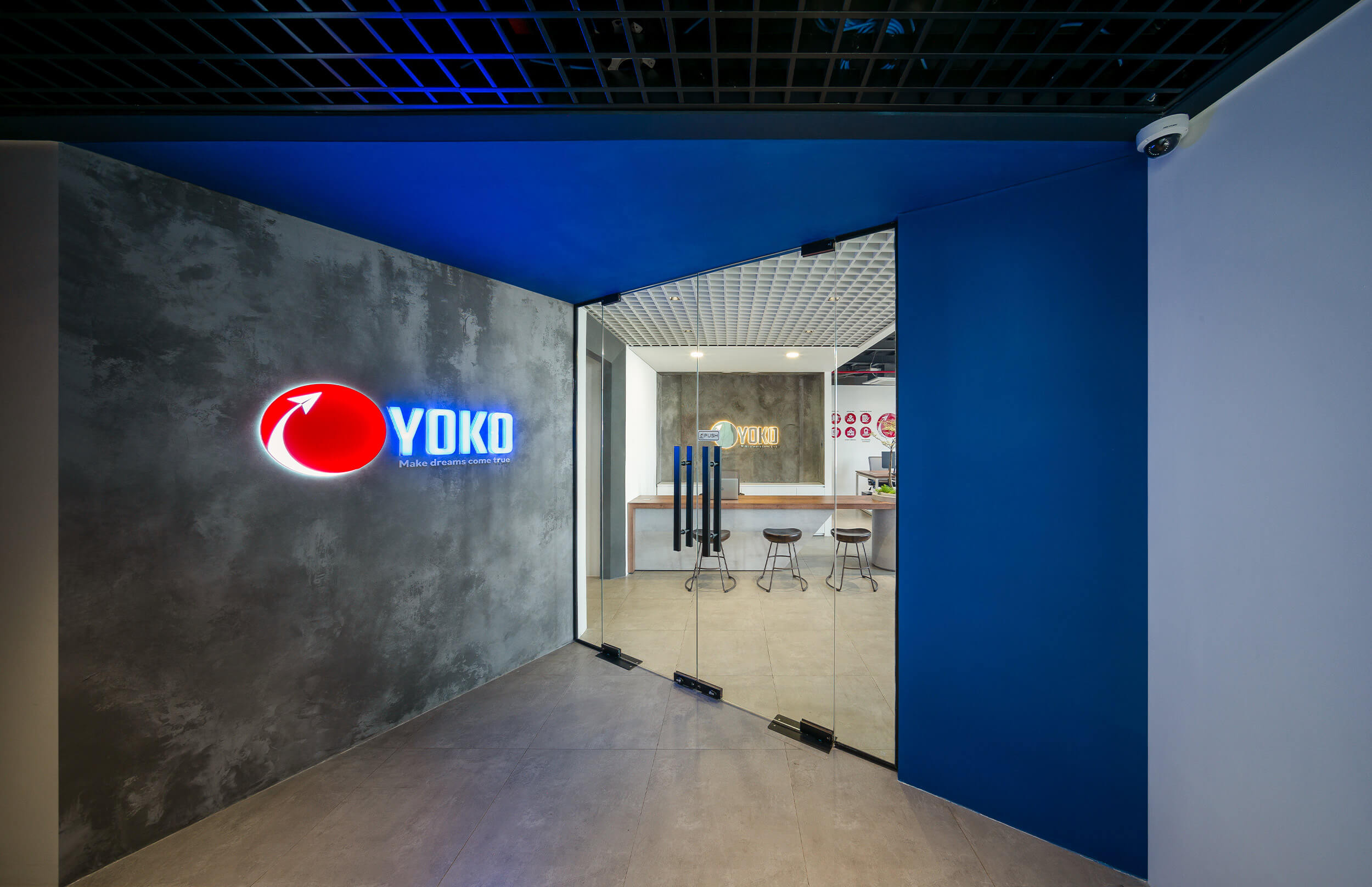
DETAILS
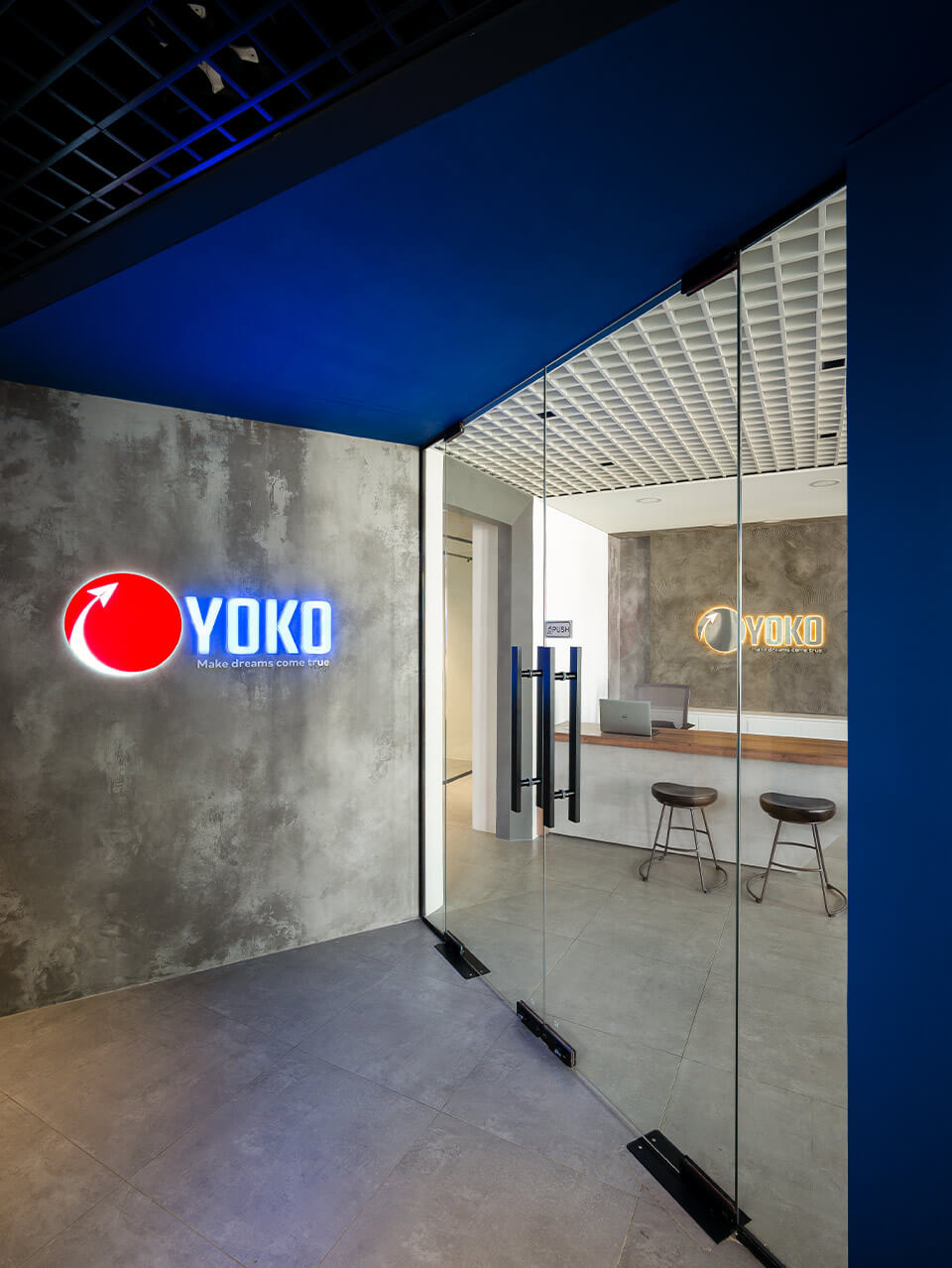
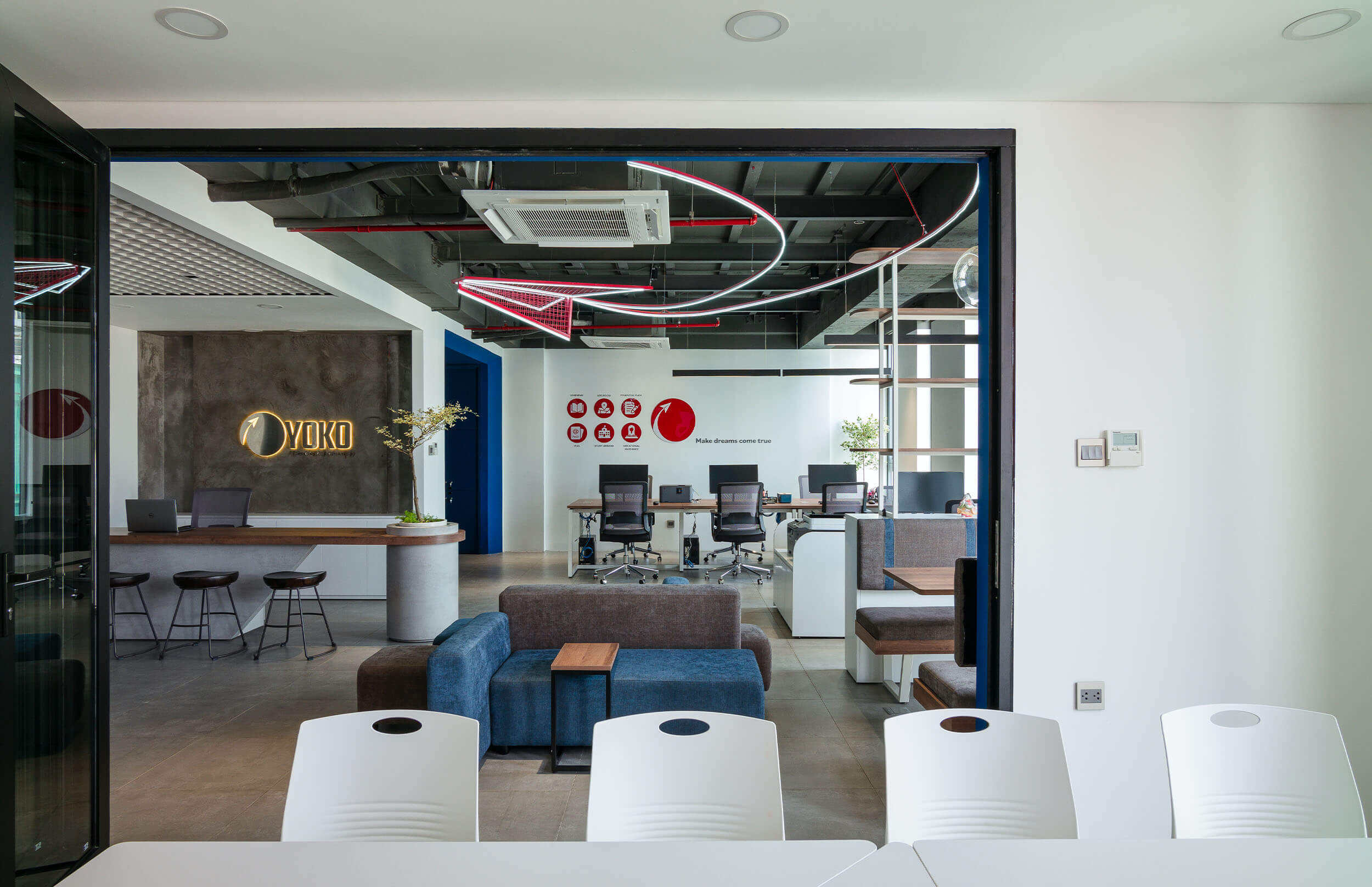
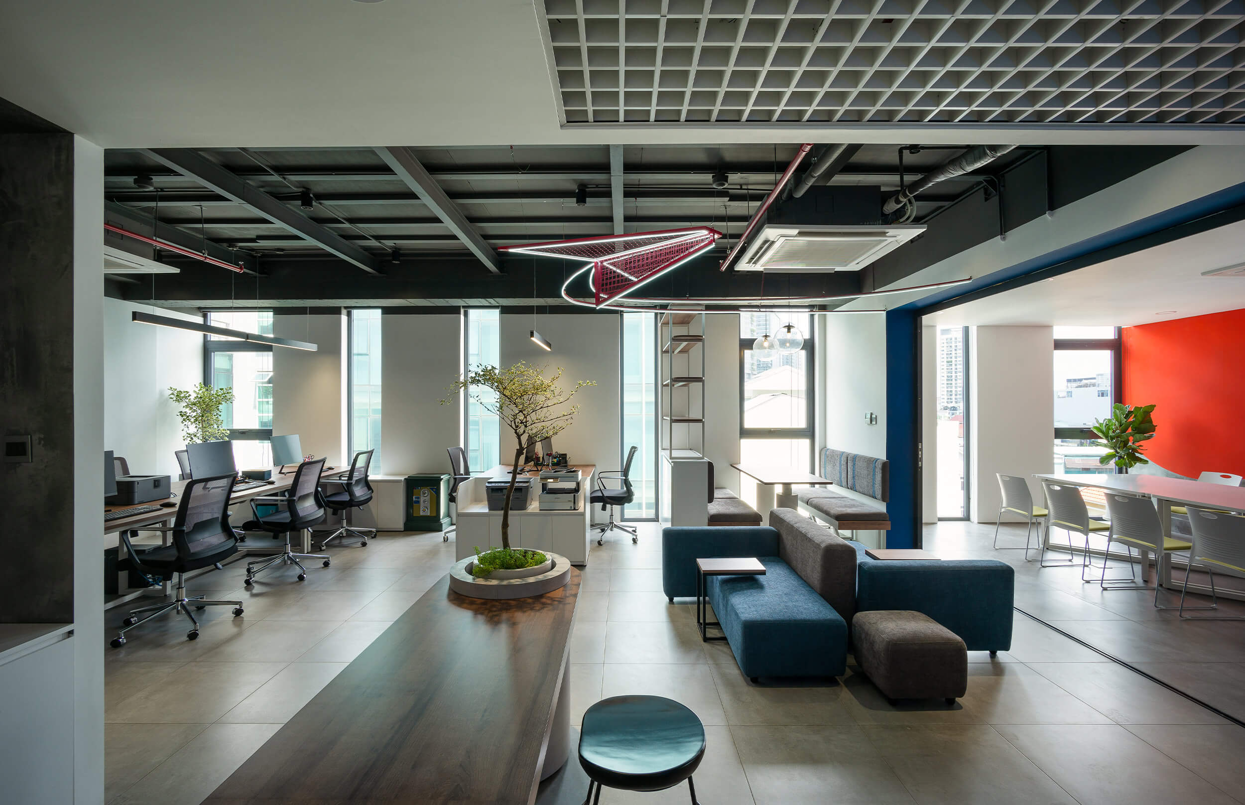
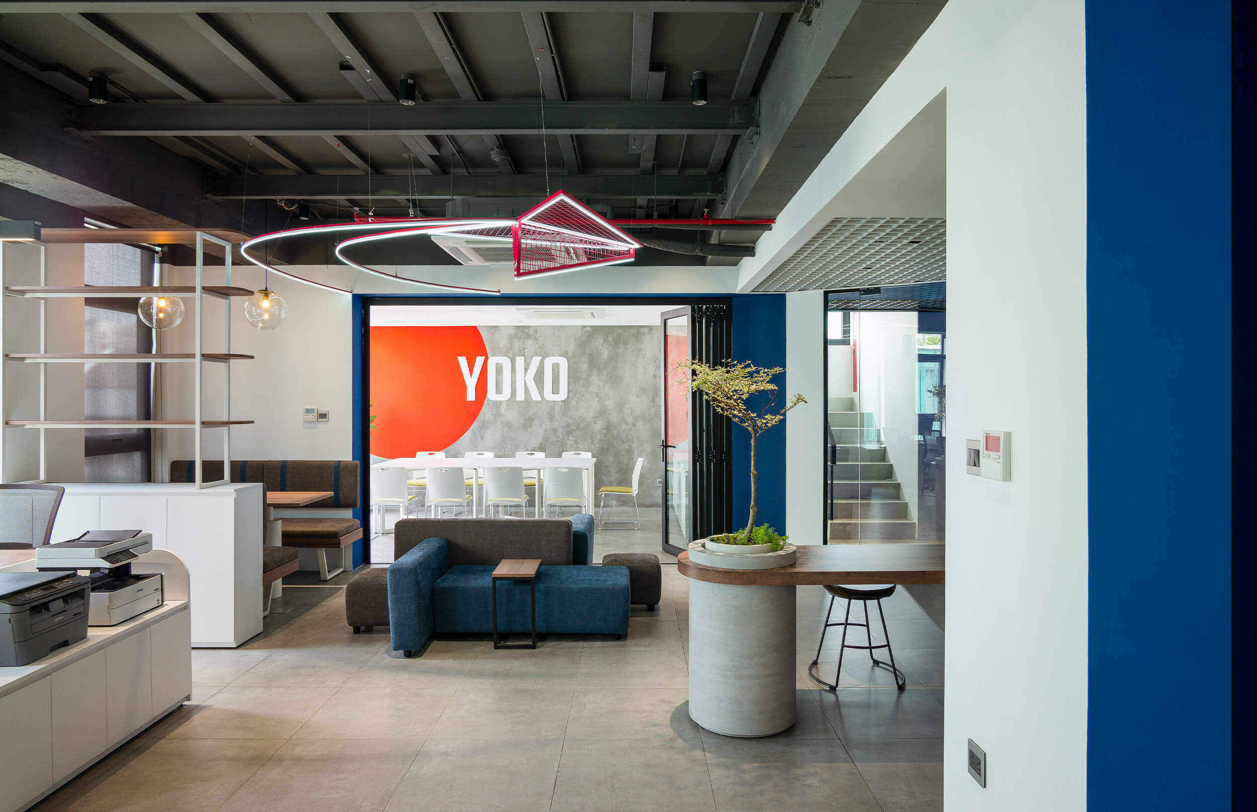
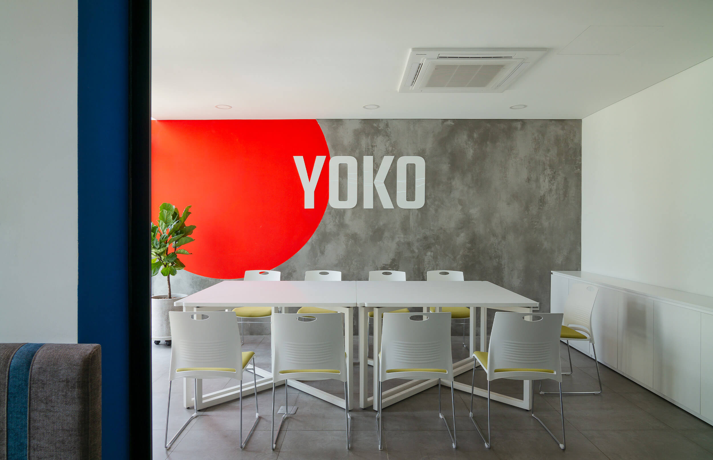
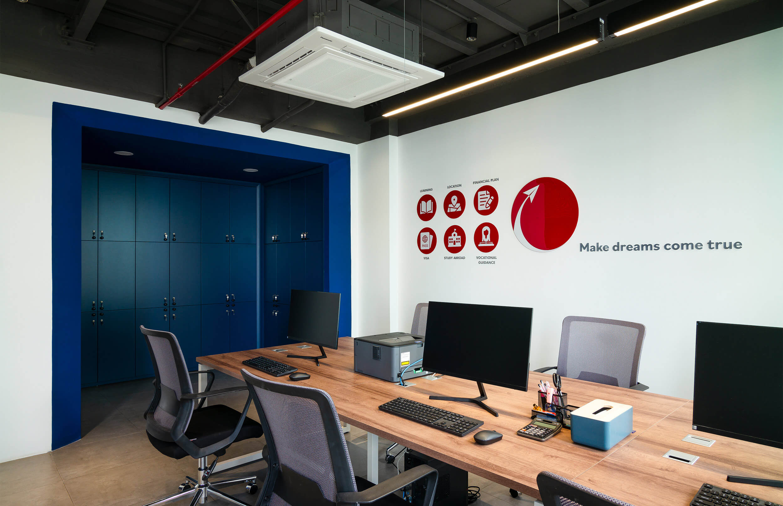
- Inspired by the logo of Yoko – a Japanese study abroad consulting brand, we designed a minimalist working space, imbued with the brand’s identity.
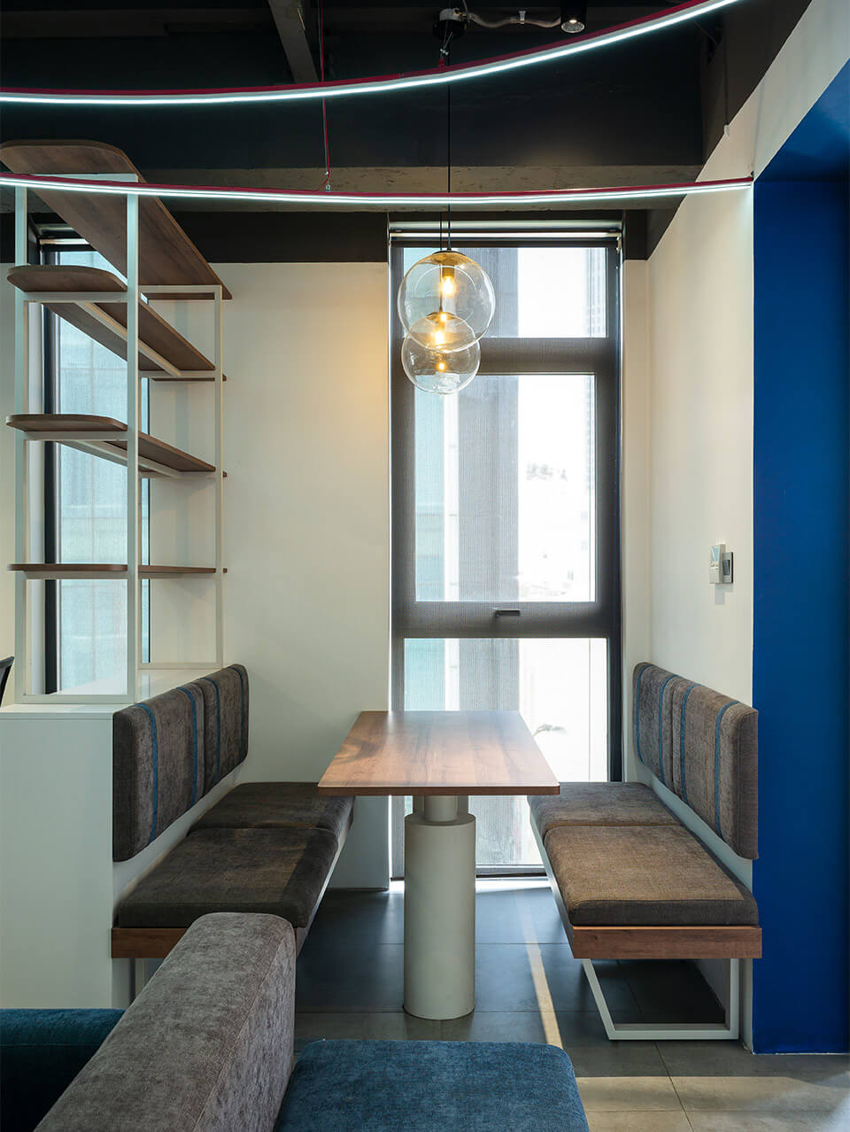
- White is used as the background, other colors (blue – red – gray in the identity set) are exploited to help create the effect of dividing space, creating highlights and depth.
- The space is coherent when using straight lines, square and simple planes
- The image of the sun and the airplane in the logo is used as special highlights for a minimalist space – blue sky, red sun, where the wings of the journeys spread.
LAYOUT
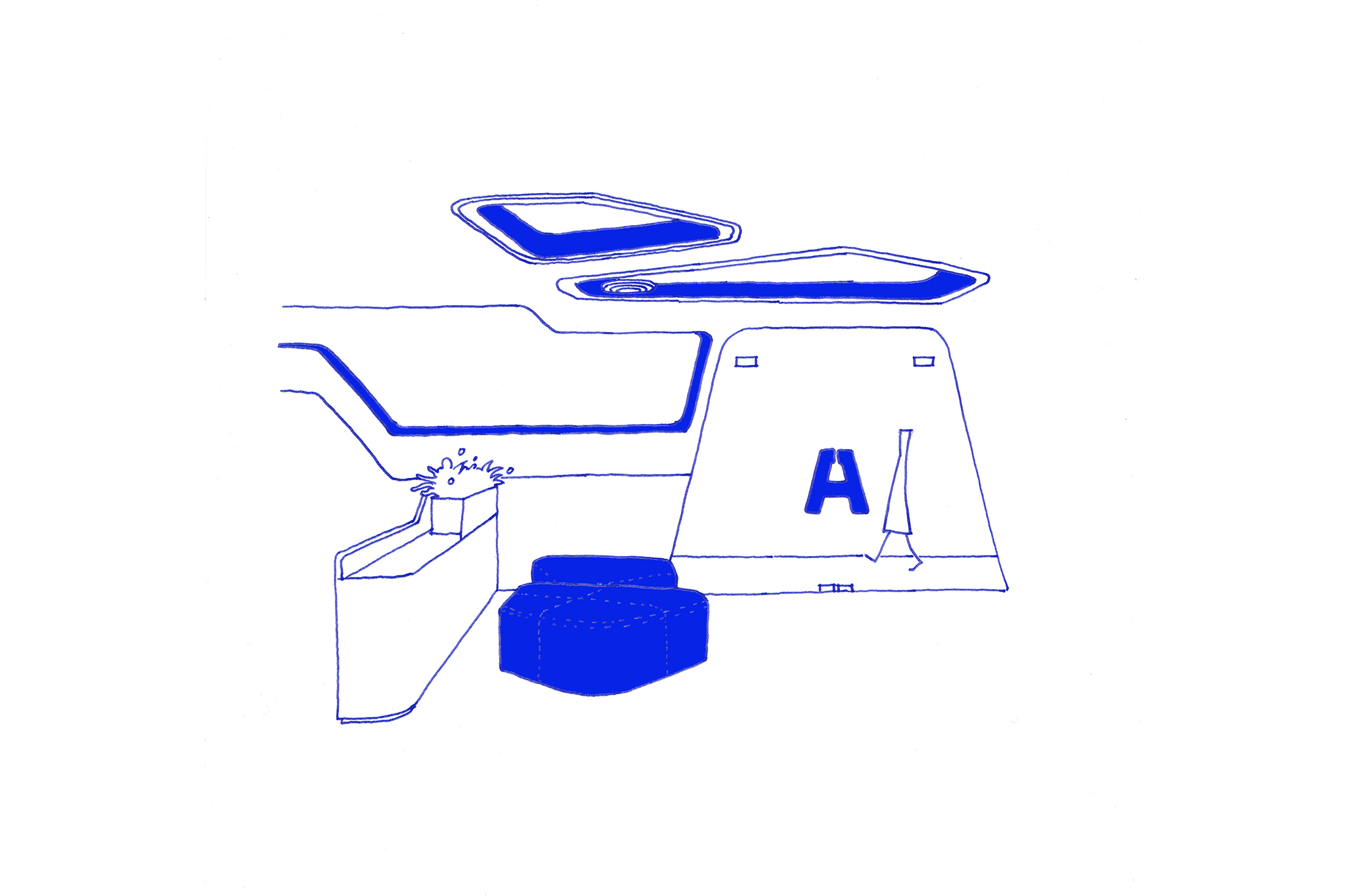
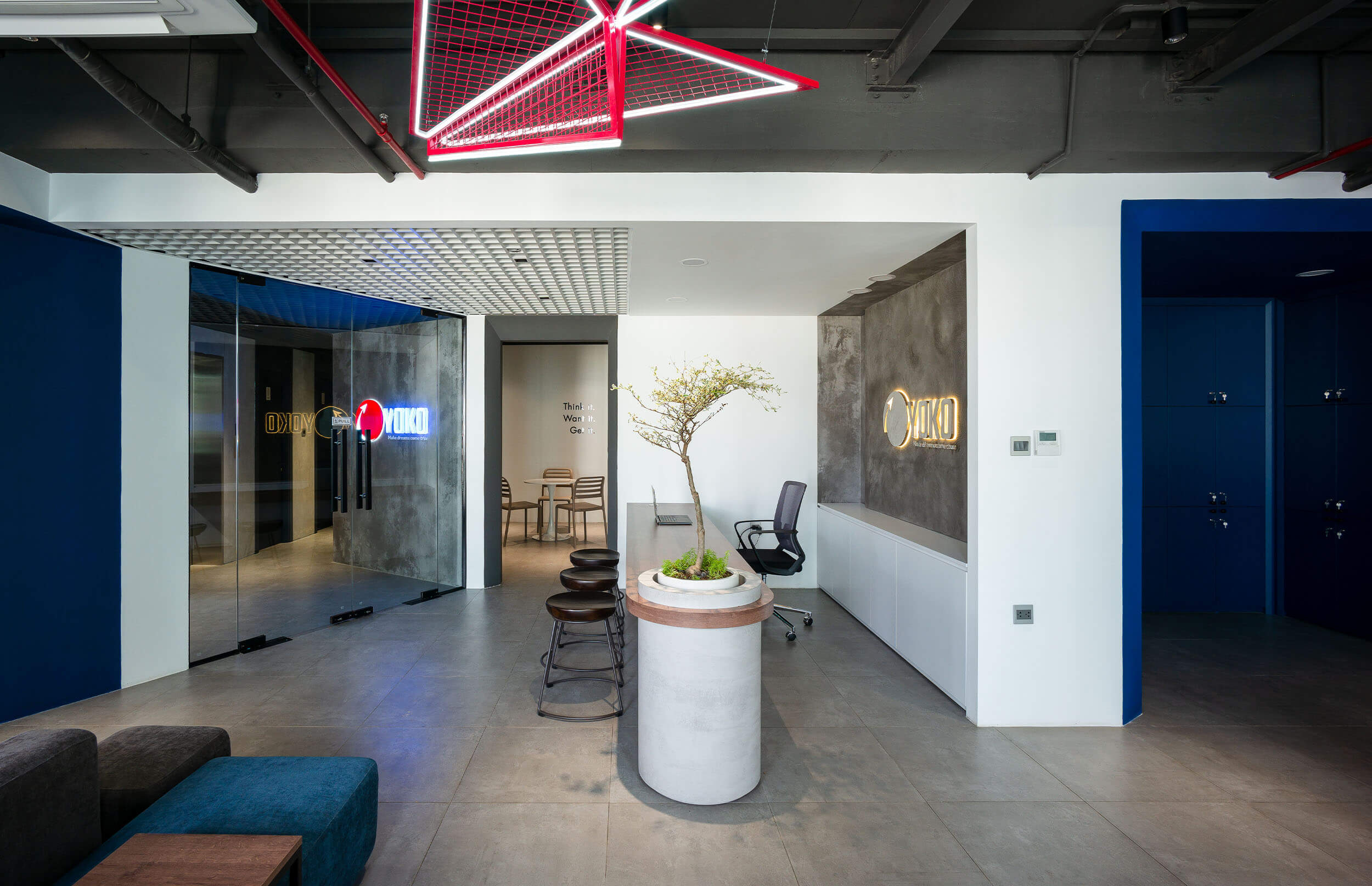
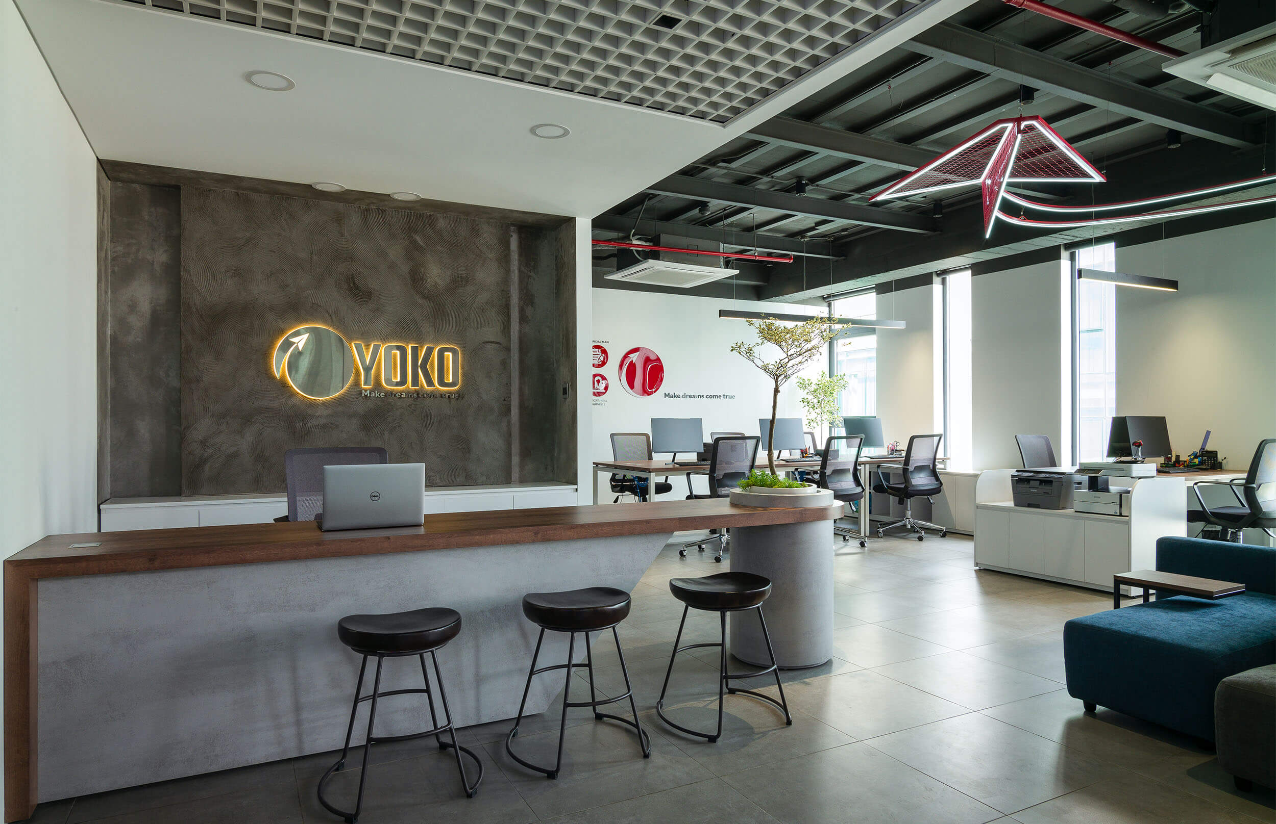
- The ground floor – the lobby space is simply designed with a waiting area, building signs.
- Reception area, reception area:
The reception desk has a friendly design, bright colors, located opposite the entrance, with seats that can be used as a consulting place or customers can wait here.
The selected chair is a lounge sofa, including movable blocks, easy to arrange for flexible use in many cases.
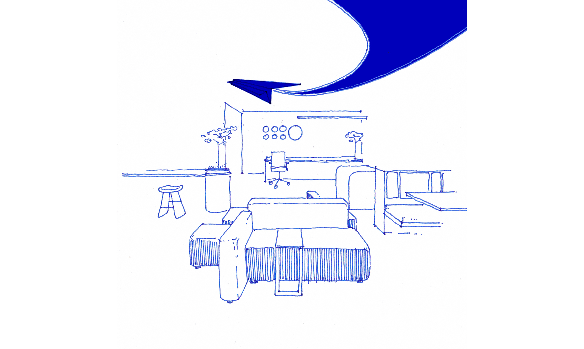
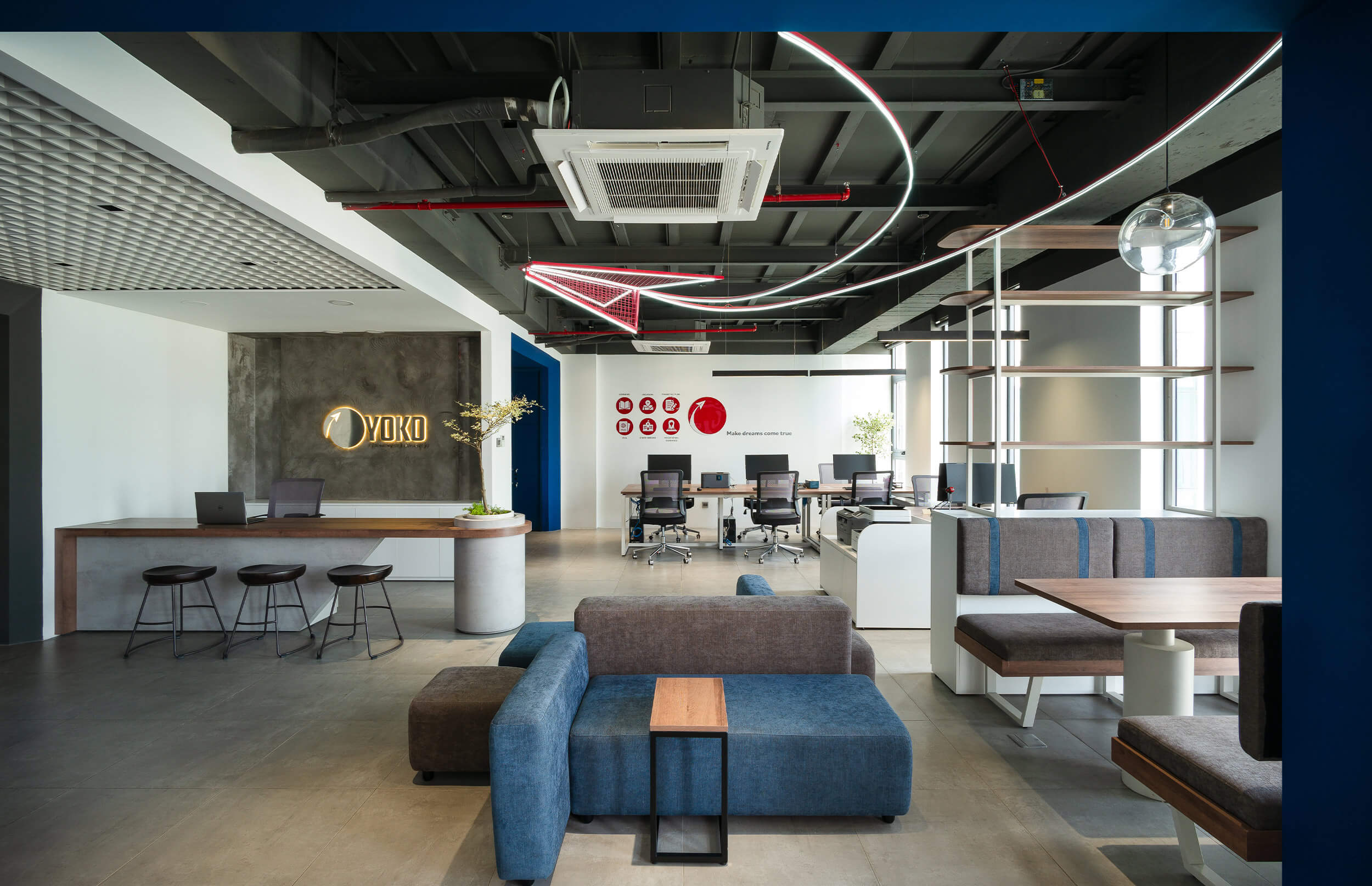
- Working area: located opposite the pantry area, including the manager’s position and the staff’s desk.
- Functional area:
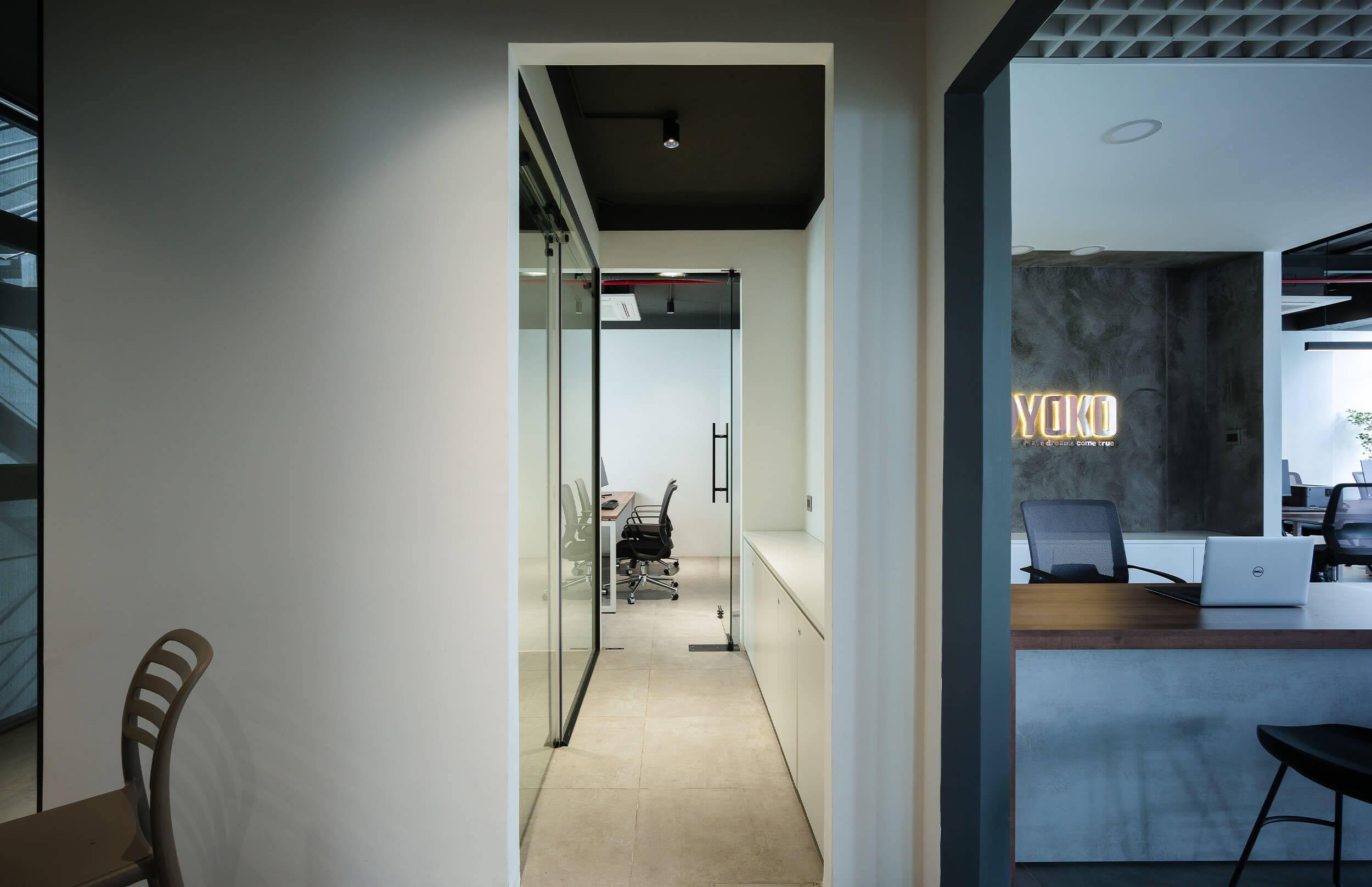
Open meeting room with a mobile wall system that can be closed when a private meeting is needed
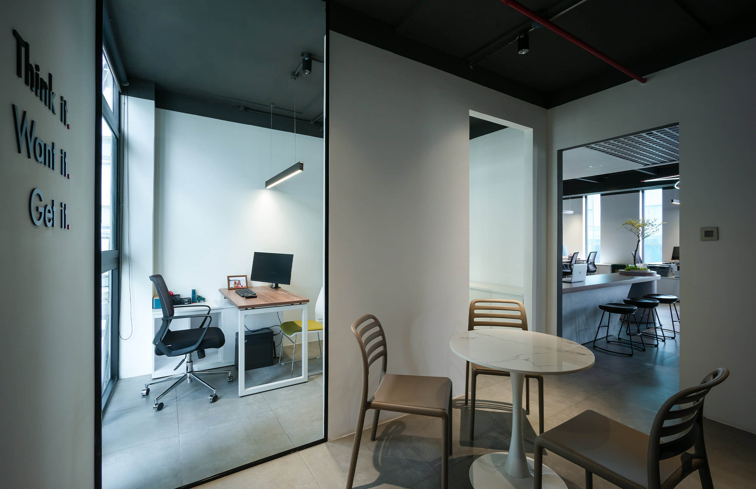
The working booth helps employees change their working position or use it as a quick meeting room for the team or as a consulting table. The booth is located in a position that is easy to access the lobby and other spaces of the office.
- Area: 140m2
- Field: Study abroad consulting
- Address: HCM
Please follow and like us:
Dự án liên quan