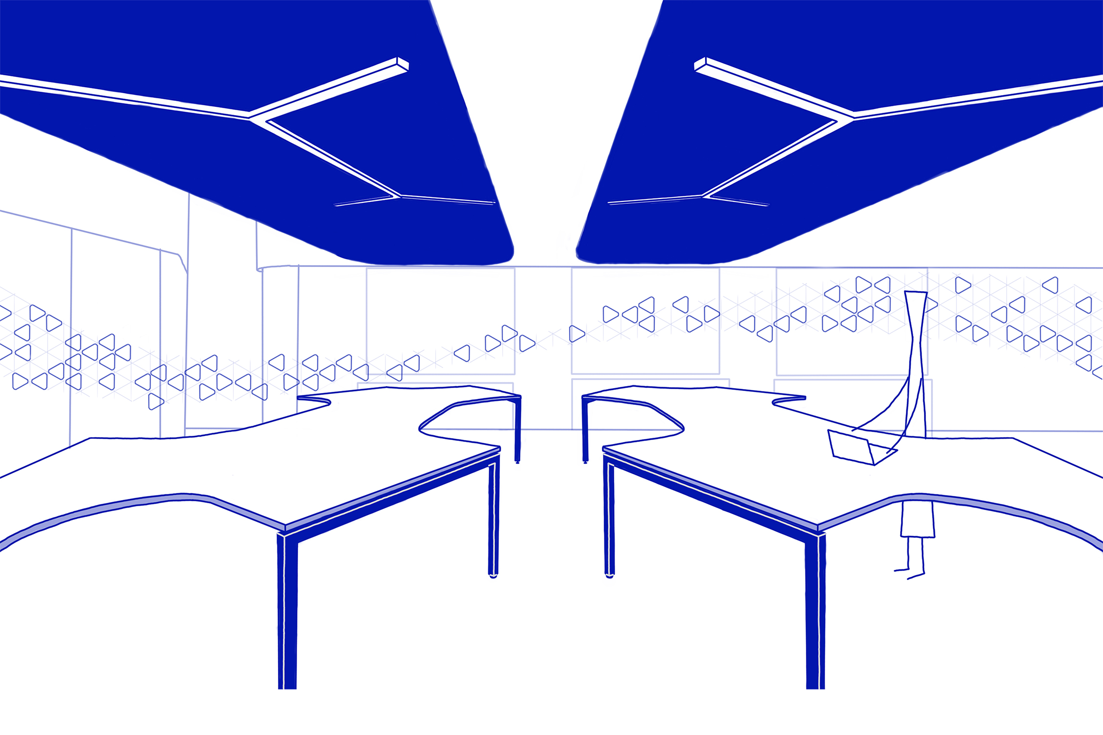
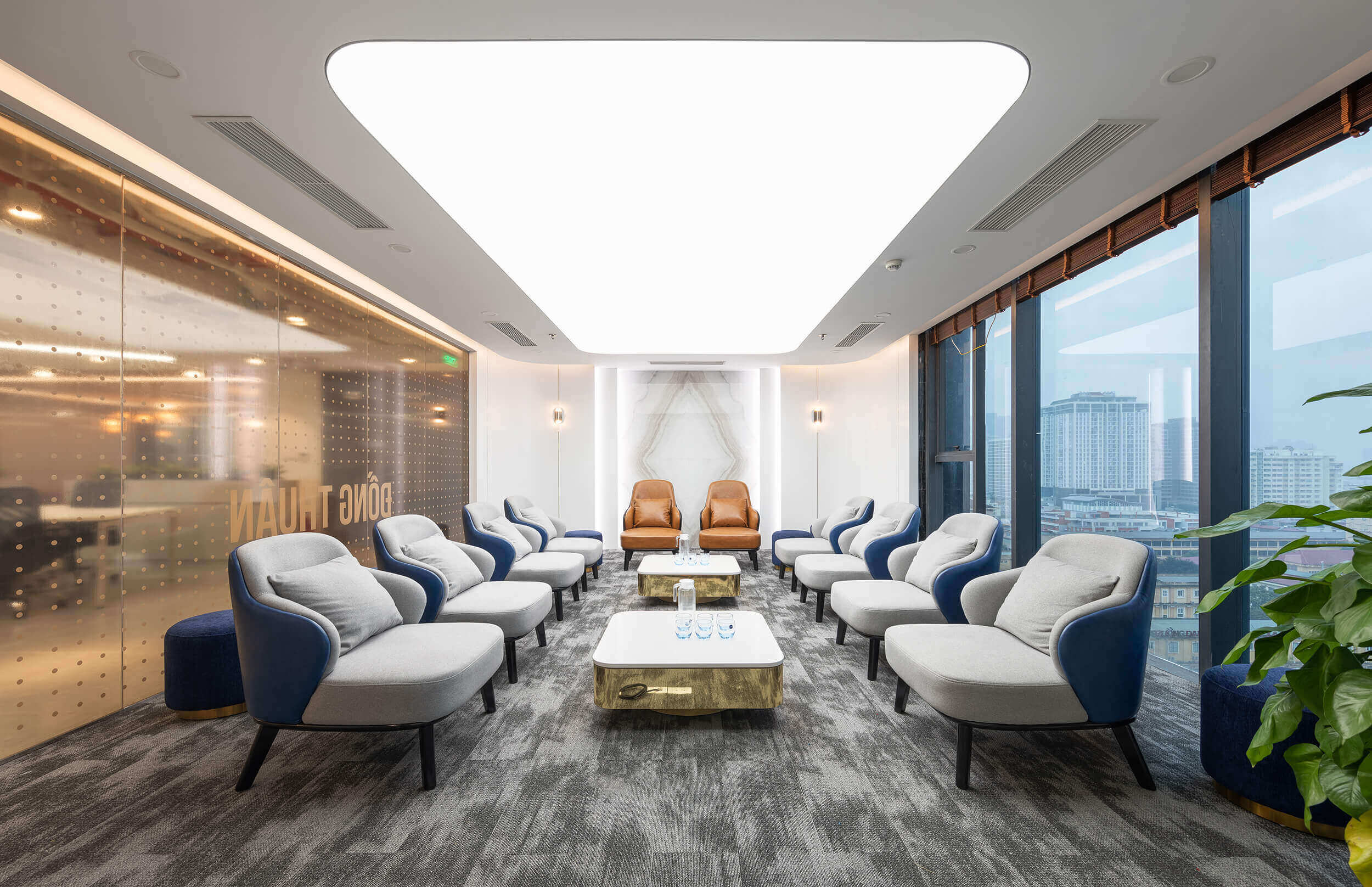
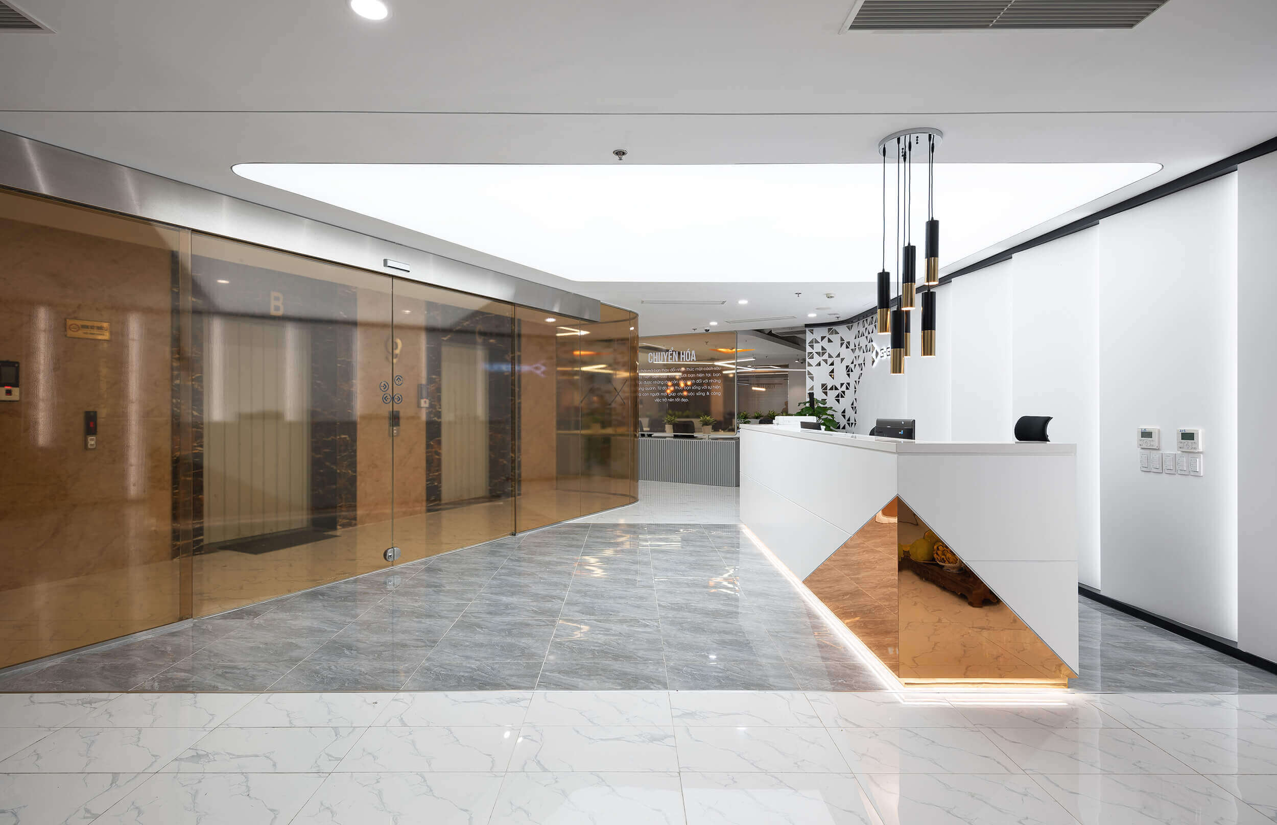
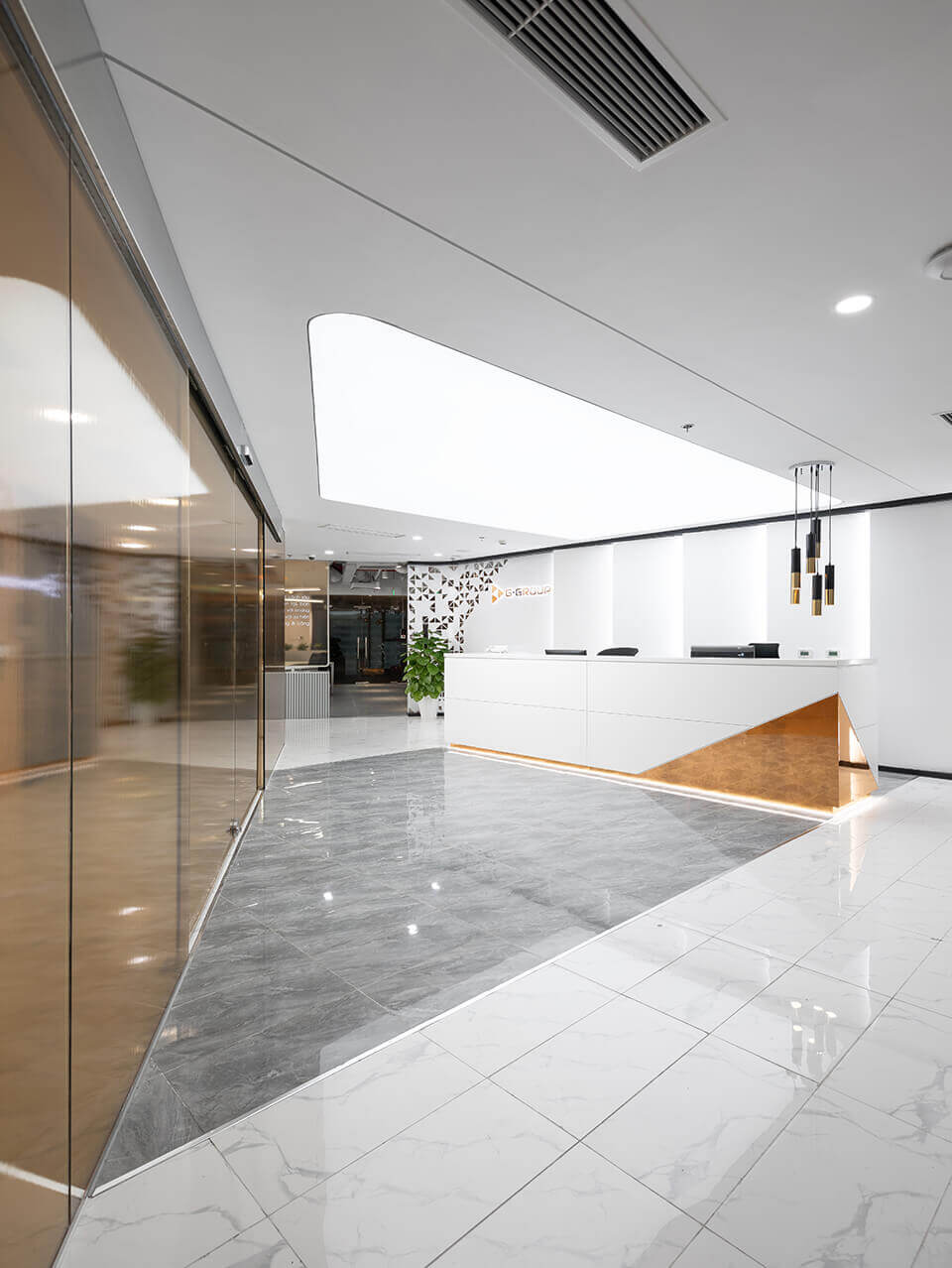
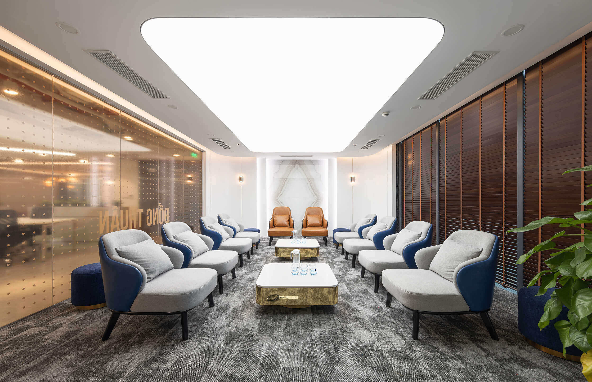
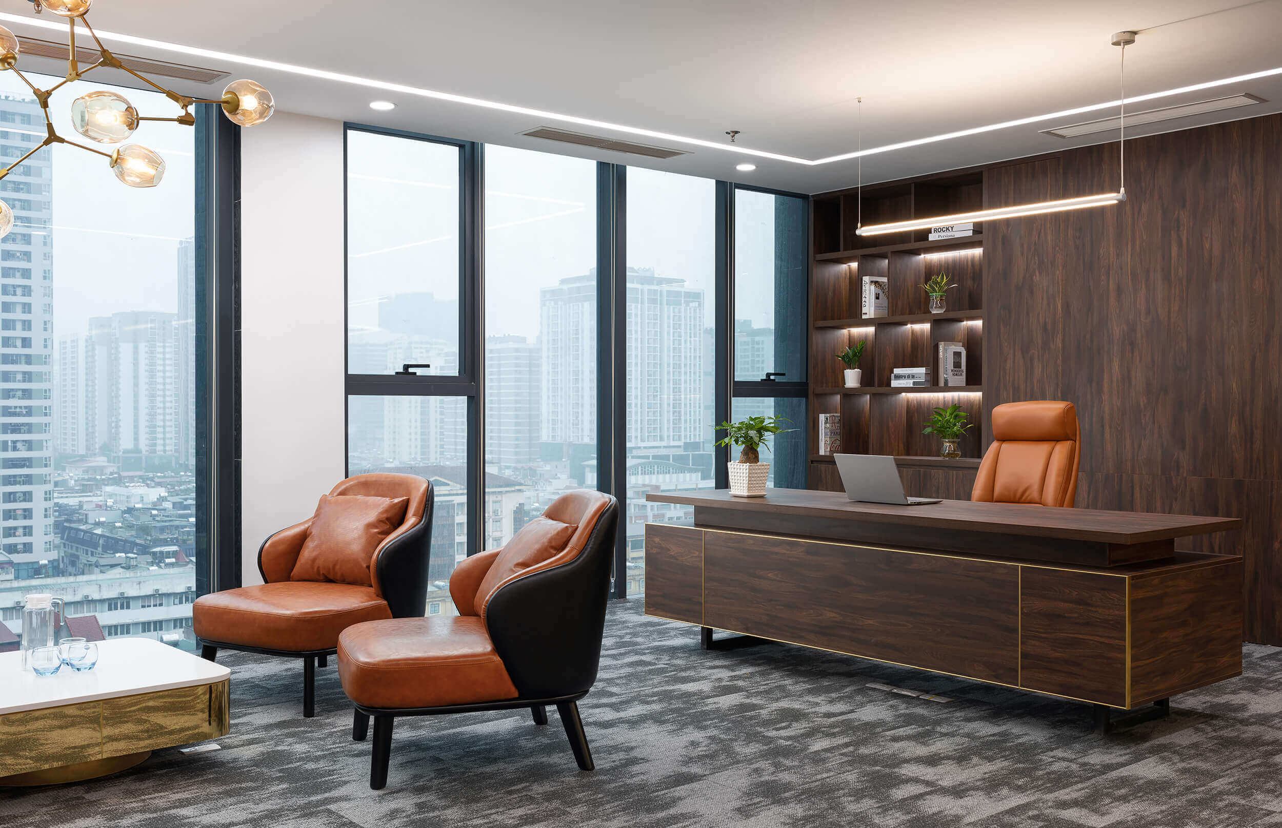
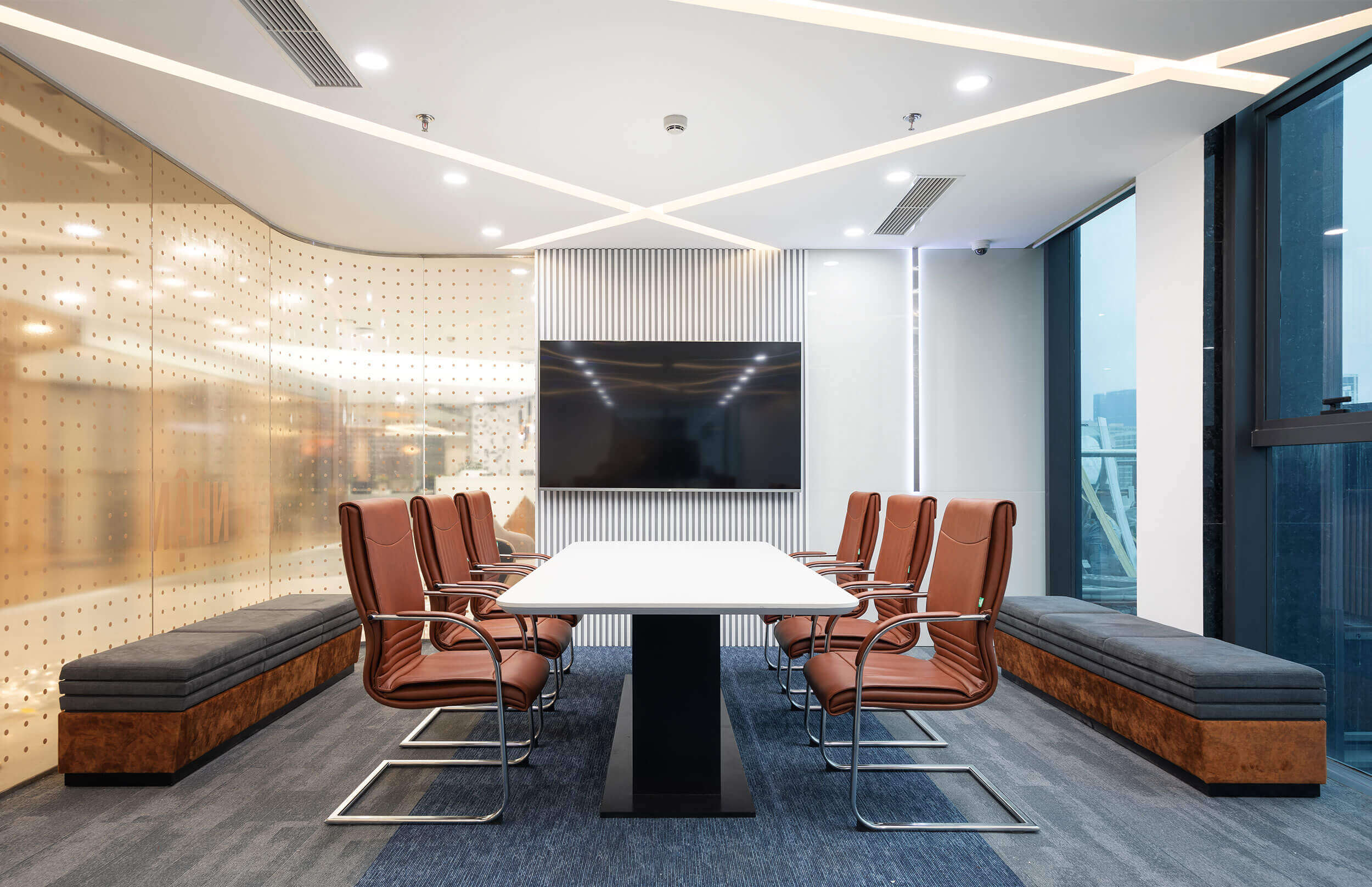
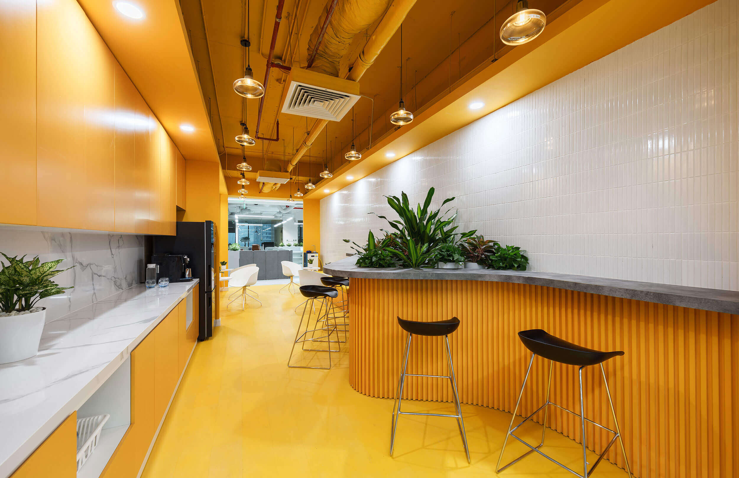
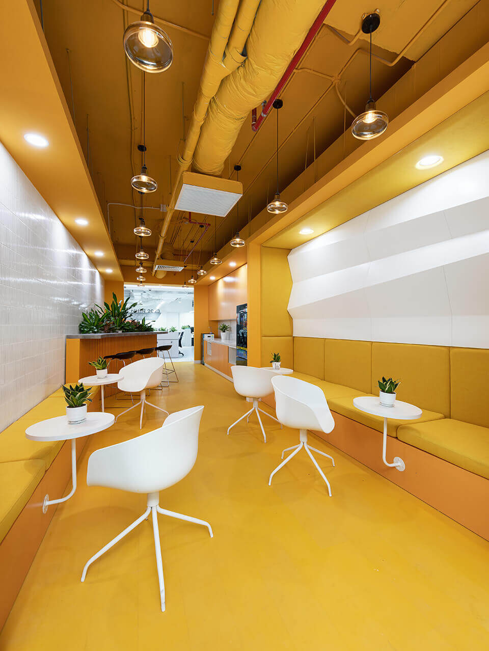
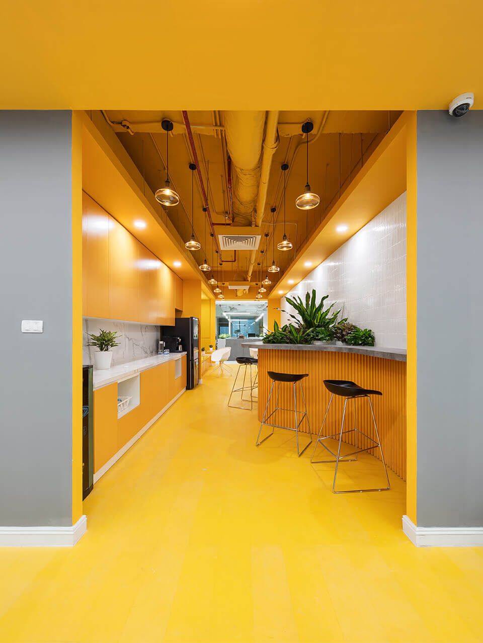
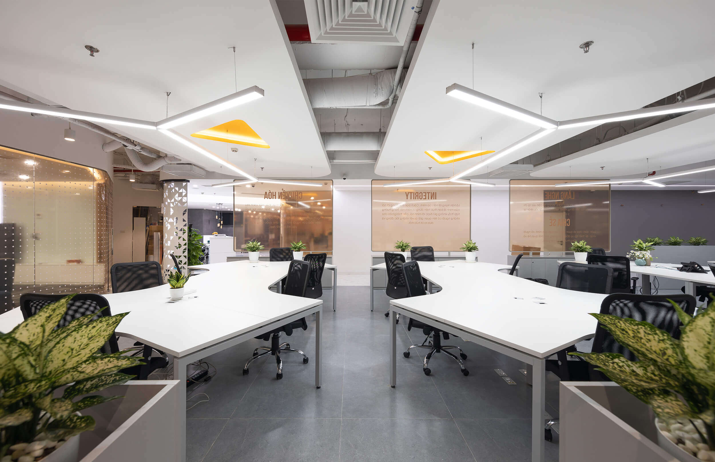
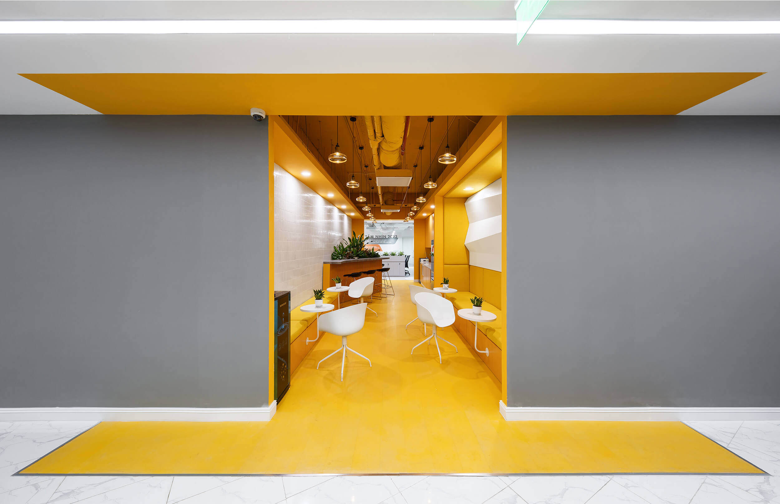
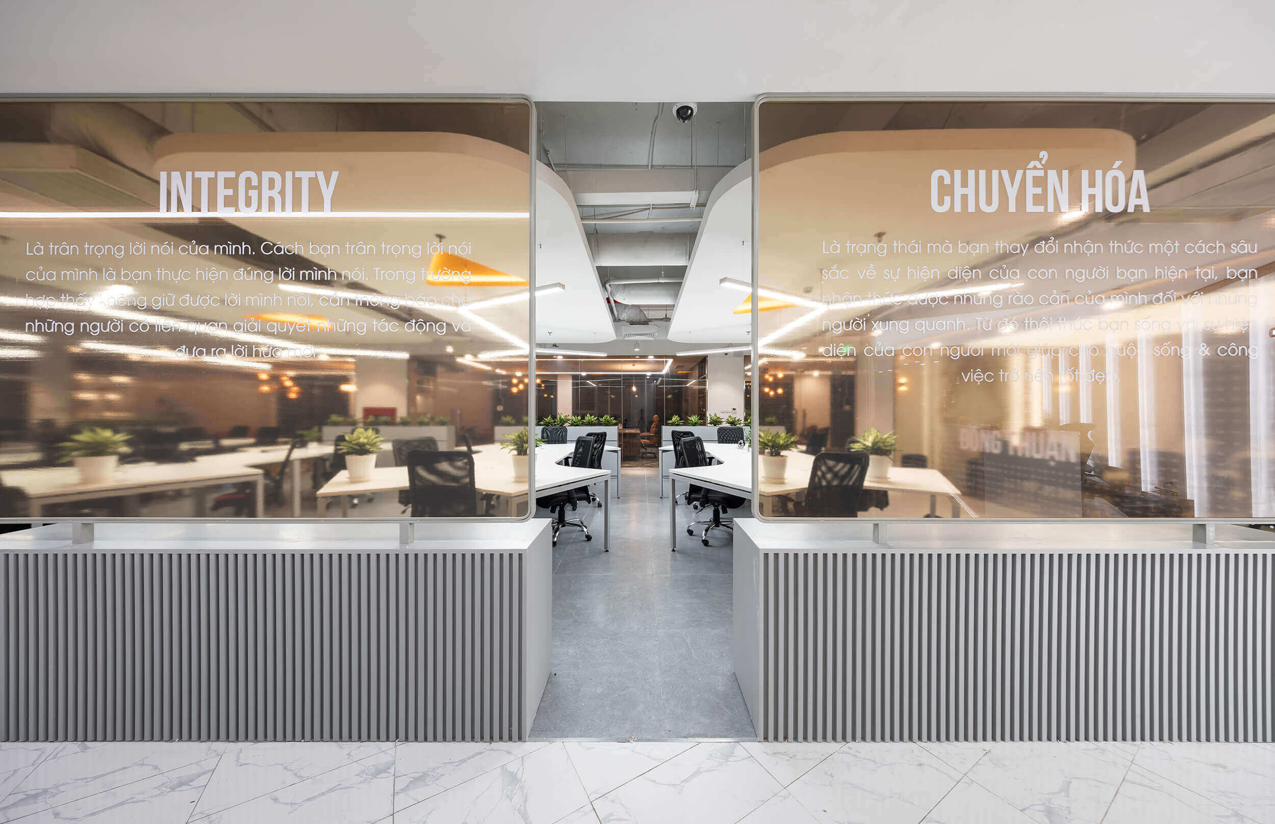
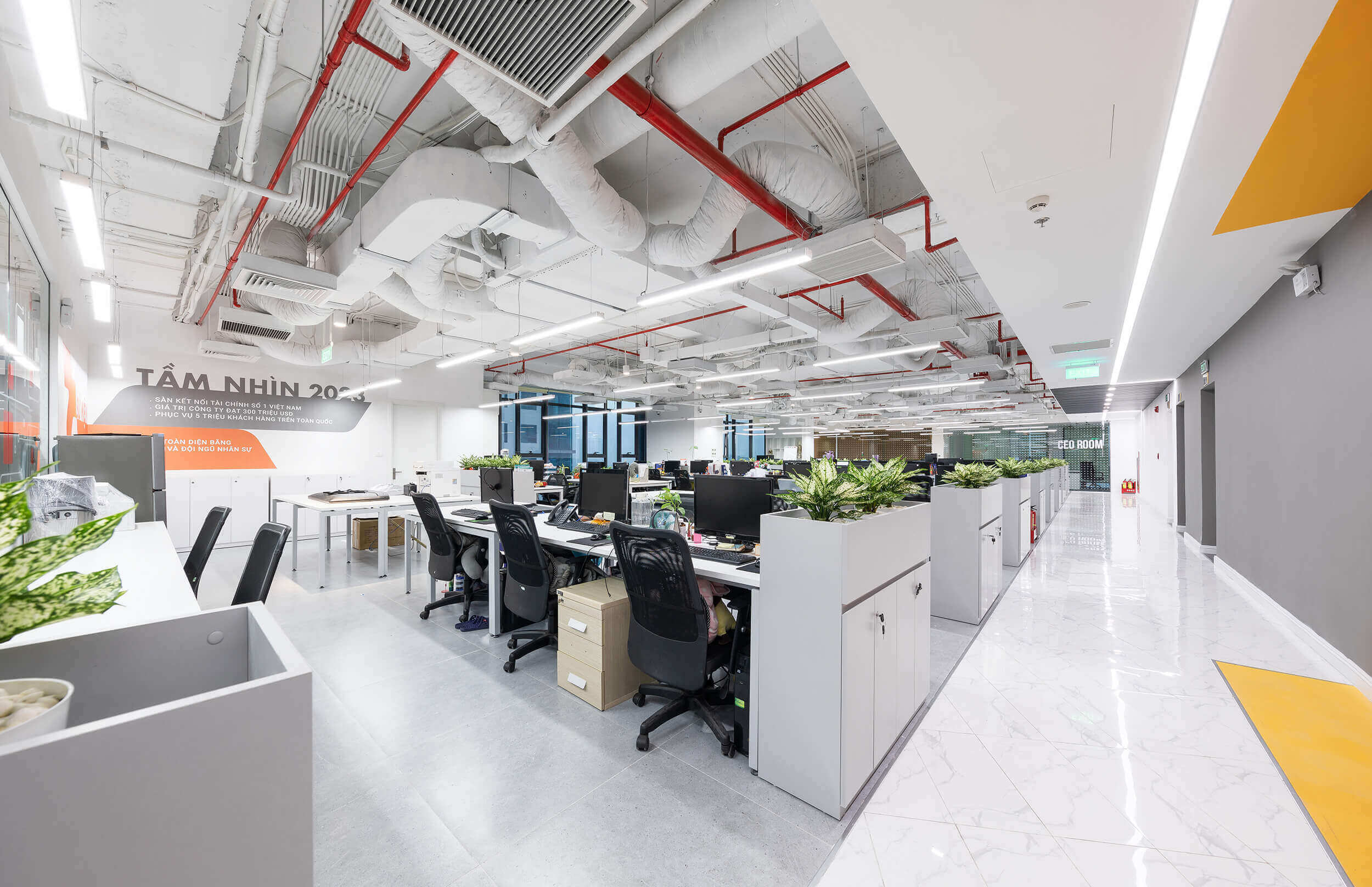
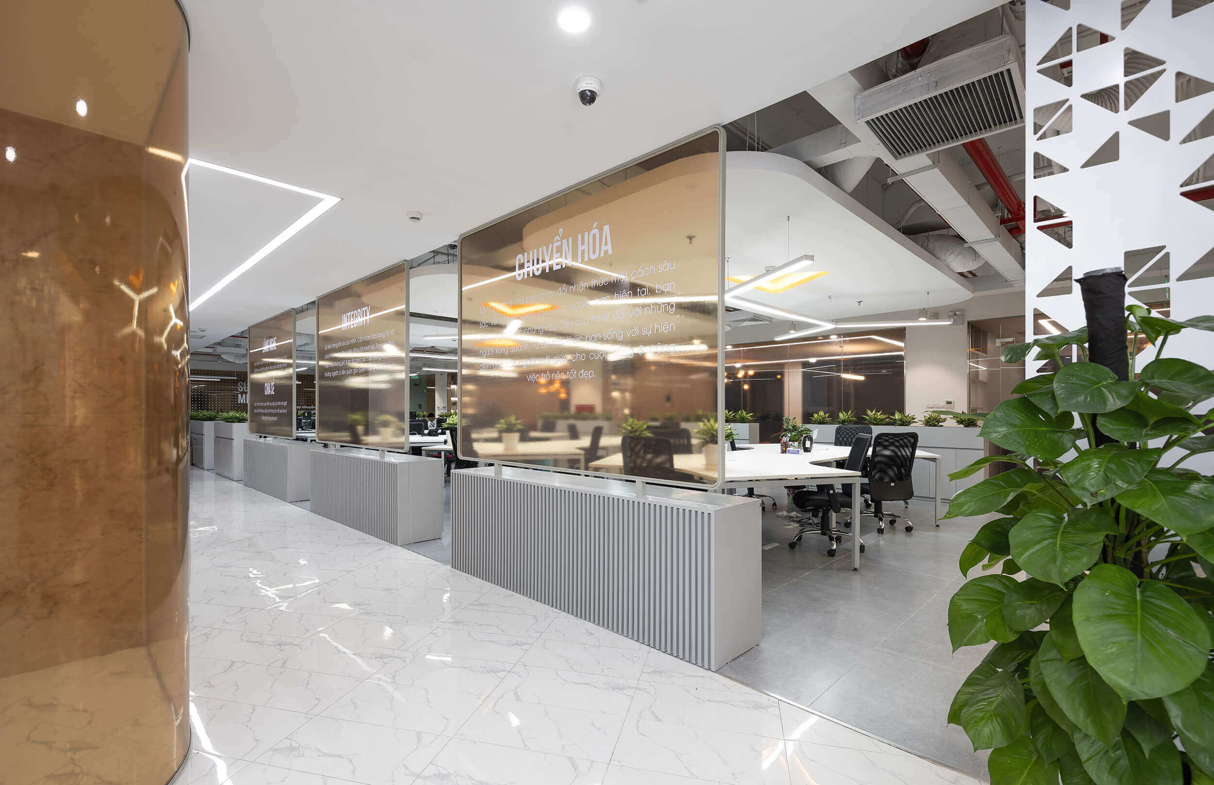
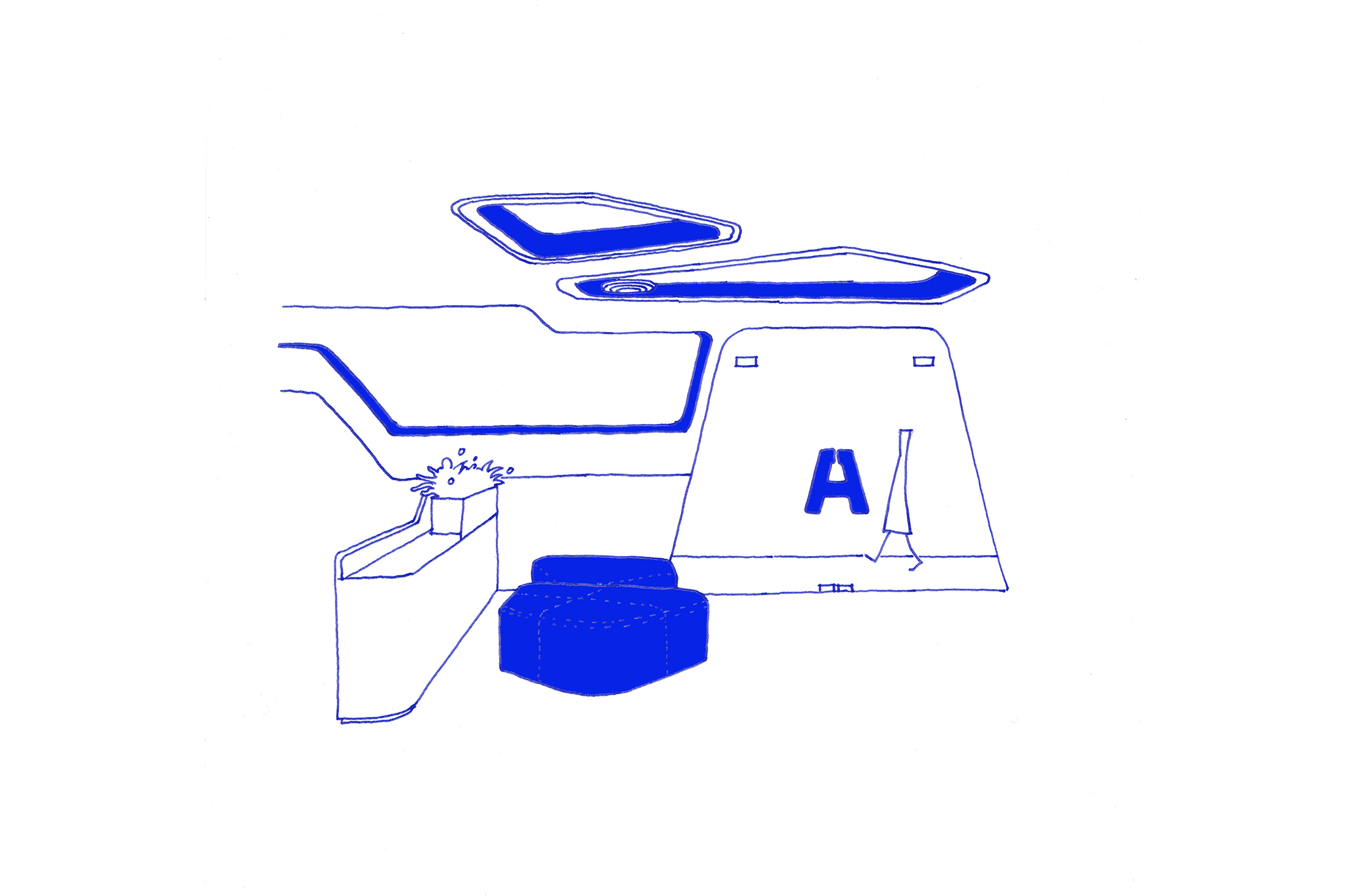
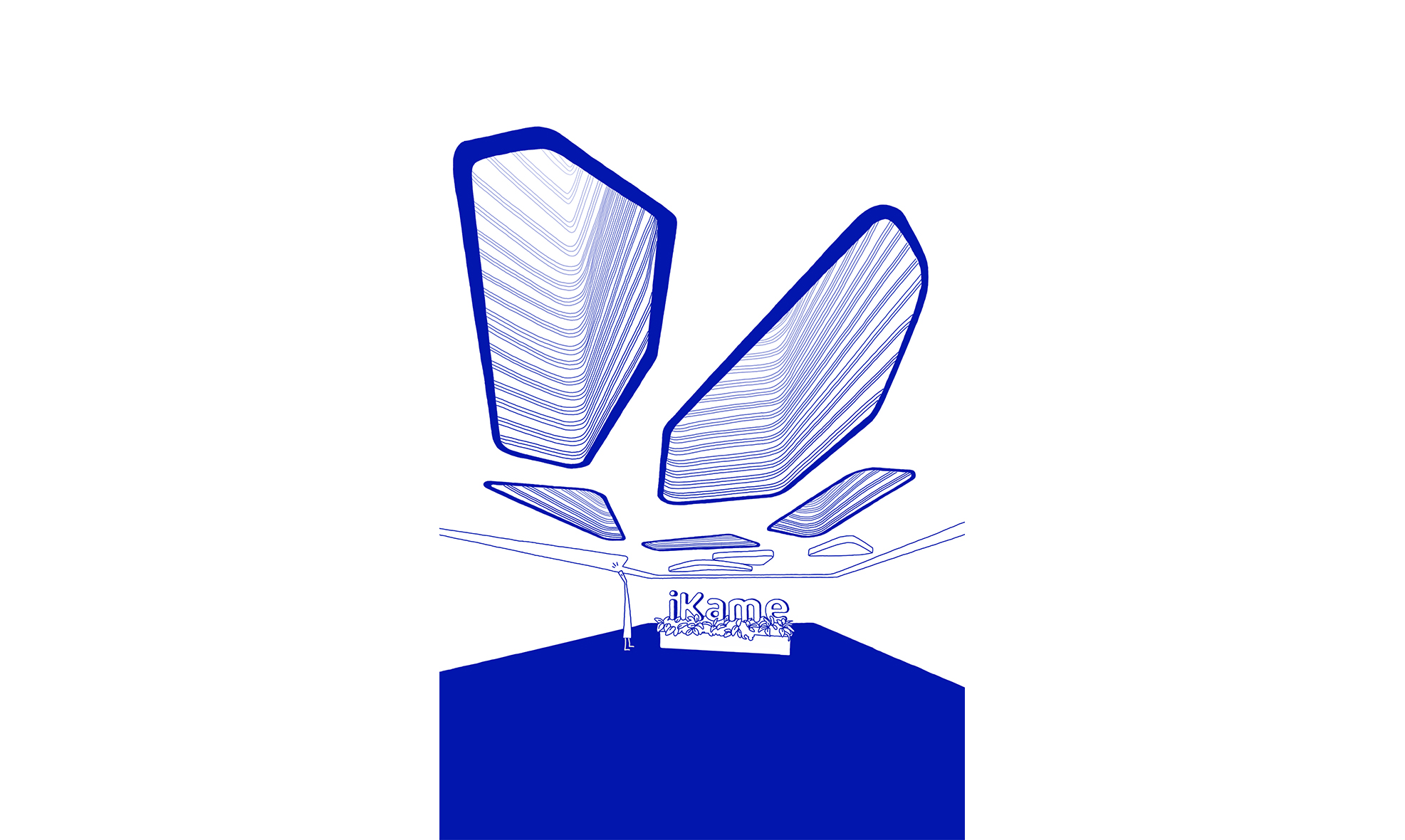
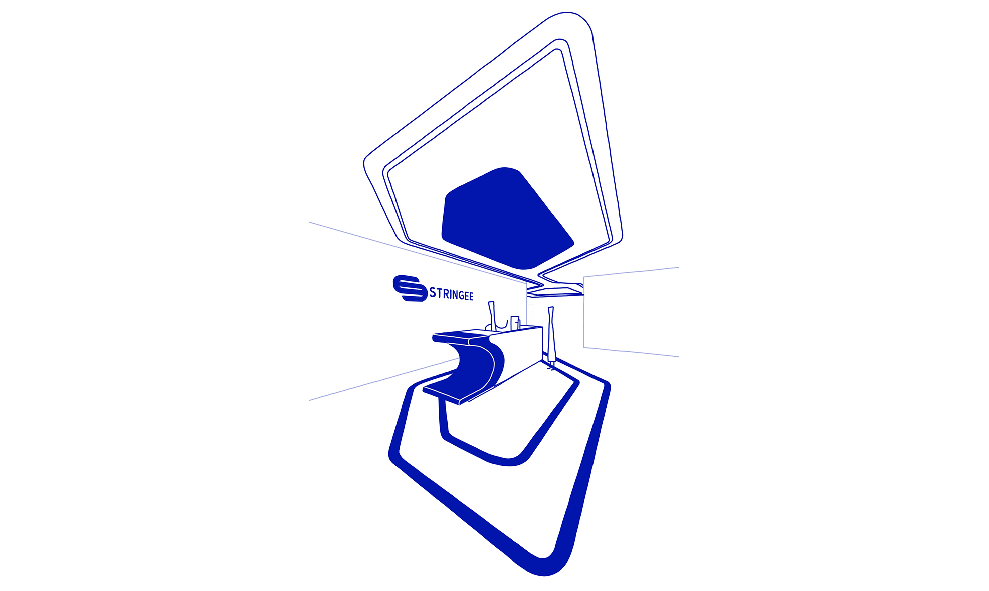
G-Group is a multi-sector corporation composed of various smaller companies and brands, so the layout design needs to delineate each area. The entire space is divided into three parts: two personal work areas situated parallel to each other, connected by functional spaces (lobby, pantry, reception room, and meeting rooms).
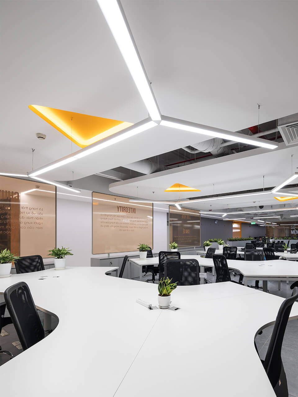
The triangular symbol in the G-Group logo has been developed by separating and using the technique of repetition, randomly repeating it to create a pattern applied throughout the project.
The brand’s yellow is an interesting colour that conveys energy and a spirit of optimism. We also incorporate grey to provide visual balance due to the solidity that grey brings.
- Industry: Technology
- Year: 2020
- Location: Hanoi
Dự án liên quan
